How I Styled It #1
This post may contain affiliate links. If you purchase through links on my site, I may earn a commission at no cost to you. For more information, please see my disclosure policy.
I’m beginning a new How I Styled It series of what I find at the thrift store. Today is the first one I’m doing about things I thrifted and then styled in my home.
I kind of went about this backward, as I meant to take photos of the two items I got thrifting before I styled them. But alas, I forgot.
But it is what it is. I’ll try to remember to take photos first for How I Styled It #2. So you’re seeing it as it is now, rather than the other way around.
Decorating With Thrift Store Finds:
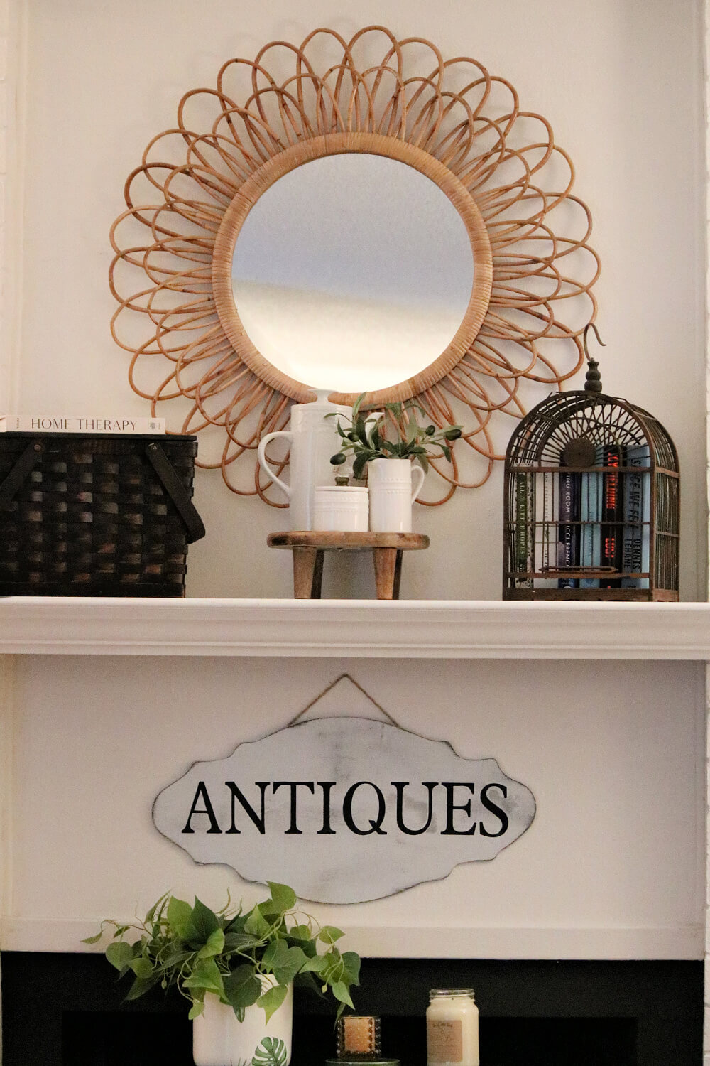
Last week at The Salvation Army, I purchased the brown basket on the mantel. It has a wood top.
I thought it was perfect for small spaces, as I could use it to store things. I’m going to store my candles in it.
The second thing I purchased is the large white pitcher with the lid. It has a bit of a modern look. And it was a little different, so it caught my eye.

What I Paid For My Thrift Store Finds:
I paid $15 for the basket and $3 for the white pitcher. I’m thinking it looks too dark up there, and it’s pretty dark in my living room.
Should I paint the basket a lighter color and maybe add a pretty transfer to the front?
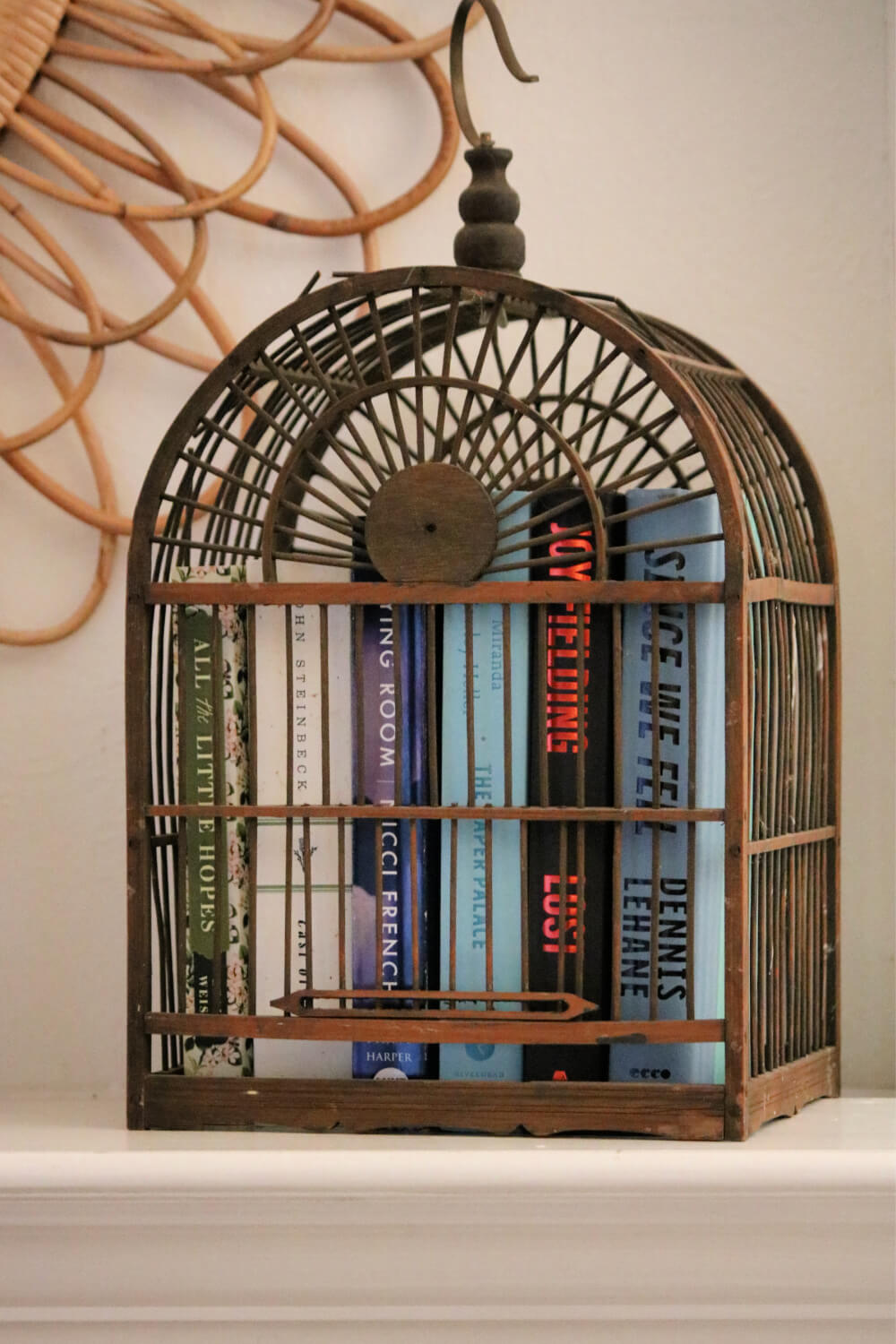
I brought the brown bird cage, which I thrifted years ago, in from the patio and put books inside it. Bloggers tend to turn their books so the pages are showing instead of the spine with the book name.
I tried that look. But it didn’t work for me. It looked backward, which of course it actually is. I guess backward is a little beyond my skill set.
Books Turned Backward Decor Trend:
Neighbor John happened to come in here on Sunday when I had them backward, and that’s the first thing he said.
“Hey, you’ve got the books turned the wrong way.”
I said: “That is the decorative way.”
And he said, “But it looks funny. And my dad was a decorator for J.C. Penneys for years, and he never turned books around.”
What was I going to say to that?
I happen to agree with him. So I turned them back around. What do you think?

I put faux olive stems in the smaller white pitcher to add a bit of green. I’m not sure if I like it though.
So what are your thoughts on the dark brown basket? Maybe just whitewash it? Or leave it be? And if I paint it, I’d probably paint the bird cage.
Two Thrift Store Finds For How I Styled It #1:
Next time, I’ll show you what I bought at the thrift store before I style it, paint it, or whatever.
I plan to go out again in a few days’ time. And then I’ll do another How I Styled It blog post.


Great items. I like your style; however, I think they are too small for that space.
Definitely style your books title side out. I personally hate them turned around so you cannot see the titles. I would take the top off the basket, store your candles in it as planned and get some wispy greenery that cascades down the side lightly. You can stick it in among the candles. No painting of the basket.
Books are meant to be read, you need to see the labels and make it easy to quickly skim over the titles and authors on the side binding of the book cover and find what you want. I honestly don’t get why any “stylist” would want to turn books around and strip off the often colorful paper covers to show boring white and yellowing pages staring out of a bookcase or shelf! I would leave the colors on the basket and bird cage the same. I like how they contrast against the wall color and I think they would look too blah if you whitewash them or paint them a light color. I am a fan of contrast – dark against light. Light against lighter just doesn’t do it for me. I love the bird cage, and it is perfect with the colorful books inside it. The whole vibe from the styling is of summer time, the basket reminds me of a picnic basket where you sit outside on a blanket tossed over plush grass in sunshine and goodies come out of the basket. The olive branch leaves are a perfect touch of color, just enough.
so many great comments here! love this Cozy Little House community!
love the new finds and styling ideas.
i
Definitely style the books so you can read their titles. This was fun. I’m looking forward to more of these posts.
Absolutely would want to see books the correct way!! But I love books…maybe that is the difference. You have lots of interesting ideas…enjoyed seeing this. And to me, the lidded pitcher goes well with the other 2 whites. I agree that painting the basket, birdcage etc might be nice…but photos are hard…if I saw it in person, I might feel it is just right as it is now!!
I like how you styled your mantle, but yes, I would paint or whitewash the basket to lighten it up. I am with you on the backwards books – I don’t care for the look. The olive branches in the pitcher add just the right touch of texture and balance to the whole look.
Hey there! Well, I like your new treasures! I would leave the basket as is. I think the dark is a nice counterpoint to the lightness in the center and the birdcage on the other side is a balance. Great finds at decent prices.
My vote is lighten the basket. You could put the books under the birdhouse and put a little bird statue, greenery, and fairy lights inside the cage. Sweet finds!
All the decorator shows are using the backward books…I do not care for it at all…I have a bird cage I have too paint…you gave me the idea of putting an old bird book in there we have with a vinyette…love pitchers of all kinds…the basket is cute either way…hard to decide whether to paint it…thanks for sharing…I love this💕
I think you should leave the basket the color it is and I also think the books should have the spines facing out.
John Warner, the Biblioracle who addressed the backward books trend in his Sunday’s column in The Chicago Tribune about taking care of your books:
Q: I saw an Instagram post where the books were shelved spines in so I was like a wall of neutral-colored pages facing out. Doesn’t that look cool?
A: It does not look cool. It looks sociopathic. I am open to any number of home shelving schemes — by author, by genre, even by color — and books definitely have some decorative purpose, but they are not purely decorative, and more importantly how would you ever hope to find the book you’re looking for?
Thanks for relaying this to me!
Amen!
Great finds! And they look great on your mantel. The bird cage with the books is very clever. You’ve been holding out not showing us the cute cage before! I would paint the handle & flat trim on the basket & maybe stripes of same color on it. Maybe a light green? I would not paint the cage. Great patina on that. But whatever you do will be lovely, I’m sure. Fun post!
I.m another vote for leaving the basket (and birdcage) “as is”. It’s a nice contrast to other light elements. The books add interest in the birdcage. I’m also team show the spines with book titles toward the front. I *think* I once read that turning the books around had to do with sites/designers endorsing products, or something to that effect. I’ve also read that some designers prefer the neutral pages showing so the colors don’t interfere with a room’s color palette.
Love your vignette! I immediately swiped your idea for books in a bird cage and put a collection of small Mary Engelbreit books in my cute birdcage and placed it on our living room coffee table along with some ceramic birds and greenery. Don’t like backwards books either. I’m partial to painted baskets–I have one that I painted a sage green and then antiqued it so it looks vintage. I’m looking forward to “How I Styled It” #2!
Cute finds, Brenda! Love the pitchers and no, I don’t like the turned books either. It’s pretty, but not really functional in real life.
I keep loosing my comments for months now. Could be an old iPad. My favorite thing is shuffling around what I already own and love. All my garden chimes, animals etc. are old and sun bleached. Looking forward to get a new piece or two but I am leaning towards a simple, uncluttered look. Have fun decorating!
I think it all looks lovely! I like the books in the bird cage, and they would backward to me, as well if they were turned around.
I love the whole thing! Don’t paint anything. As for the backwards books, I read somewhere that they do that for legal reasons when the titles are going to be seen on television.
I would not change anything here. Love the dark basket. And the books…I never could understand the backward look. To me, it would drive me coo-coo. The bird cage idea is brilliant. Books in a cage, why not. I enjoyed this entire post, and it is fun to see what ideas you have. Hugs from WI
Hi Brenda – 1) I prefer to see the book titles, and the bird cage is the coolest thing!. 2) As for the dark brown basket, I think you have enough contrast with the white pieces and the lighter tones of the mirror and the bird cage. It all looks great!
I think your “pitcher with a lid” is a coffee pot, and it’s beautiful. What a steal!
Thanks for telling me!
Definitely a coffee pot, a very attractive one. Backward books make no sense anywhere ever unless in a post-apocalyptic illiterate society. Books are meant to be read, backward placement defeats that purpose.
Hear, hear!
Never understood the trend to turn books backwards. Your new white pitcher is very pretty. The basket is a little dark. Wish the wood was just a little lighter. But nice finds.
Books turned so that you can see their titles! I vote to keep the basket dark brown – it’s grounding like black is and I believe a pop of black (or dark brown) is always welcome in rooms. I also like the olive branches in the smaller pitcher. Great thrift finds!
I just lost my comments! I will start again. I love the olive branches in the pitcher. Very light and airy. And I agree with you about books and their spine showing. It just doesn’t seem right otherwise. I love your books in the birdcage. Makes quite a conversation piece! I am happy to see you are getting out and about.
There’s something in me that doesn’t get books in birdcages….It just doesn’t jive…..