Changing Up The Mantel
This post may contain affiliate links. If you purchase through links on my site, I may earn a commission at no cost to you. For more information, please see my disclosure policy.
I changed up the mantel slightly. I didn’t change it up much.
I took away the red frame and added this painting I found on Amazon for $15.99.
The New Painting:
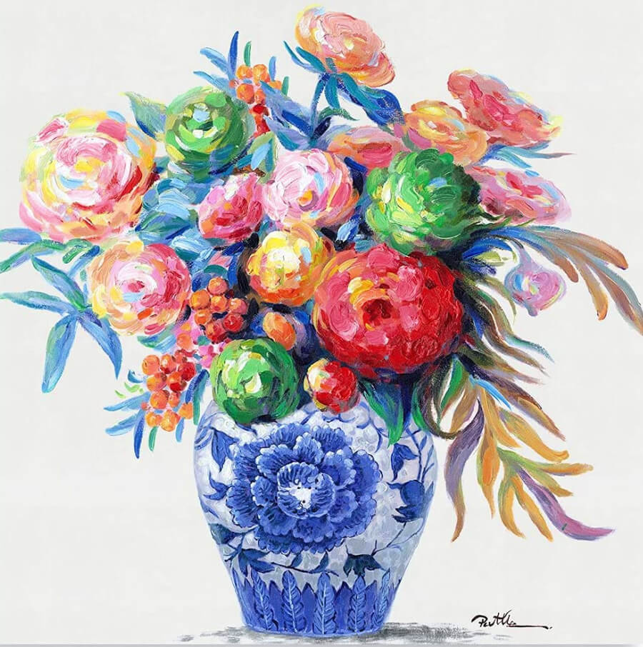
As often as I look at paintings online, I can tell you that this is a great price for a 14 x 14 canvas painting.
Since I have to do quite a bit of sitting and elevating my ankle, it’s one of the things I like to do. Sit and check out the prices of different kinds of paintings online.
It’s the decorator in me I guess. The need to look at pretty things.
I loved all the colors and the blue and white vase. Once I had a small collection of blue and white decor similar to this. I don’t know what happened to it.
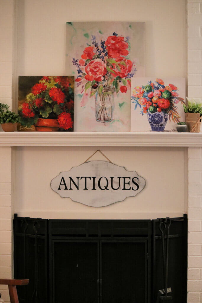
So here is one arrangement on the mantel.
One Arrangement:
All I added was a few small faux plants.
This morning I got up and looked at it and something seemed to be missing. So I added a few candles.
The two paintings that have a light background seem to blur into one another. Maybe that end needs a darker painting because the middle one is light.
Or maybe I just need to shift the paintings around. But the darker one is the smallest, so I’m not sure how that painting would look in the middle of the mantel.
I’ll keep playing with it.
The Second Arrangement:
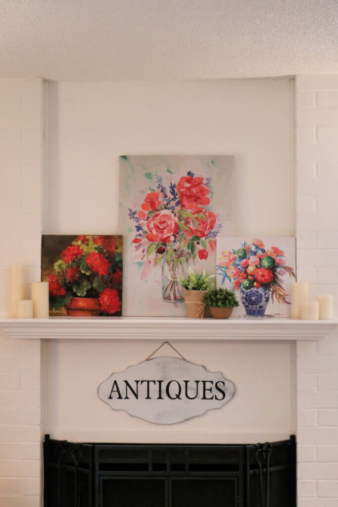
Here was the next arrangement of the mantel. Very slight and subtle changes.
I’m not sure that the little faux plants did much to break up the two paintings with the light background. Maybe a bit.
I have to be careful what I put on the mantel these days. Because Ms. Ivy gets up there sometimes during the night and swipes everything off.
So I don’t risk putting breakable things up there.
In the morning I sometimes come into the living room to see the paintings scattered about the floor. I don’t think she bothers them other than knocking them off.
Ivy must think she’s the queen of the mantel.
An Arrangement I Put Together The Other Day:
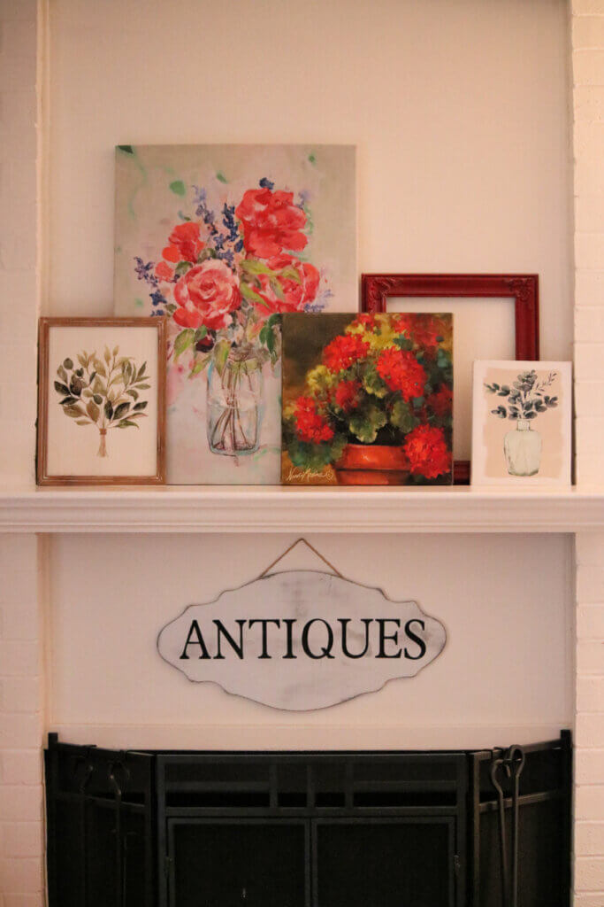
The other day I tried out this arrangement but felt it was missing something too. I guess I’ll just have to keep playing with the decor on my mantel.
This morning those two kitties were chasing each other. I can tell Gracie is just begging Ivy to play.
But I also recall when Ivy was trying to get Charlie to play. And he’d snap at her and she’d look so hurt.
Ivy has lots of funny facial expressions. She has this dismayed look and a hurt look and a disgusted look. When Gracie comes around and she doesn’t want her there, she gets this irritated look on her face.
Little Ms. Ivy is quite the character. She makes me laugh every single day.
{This post contains an affiliate link}


I disagree with everyone that the dark painting is wrong. It makes the whole arrangement! It would be blah without the depth it creates. Trust your instincts; you’re a good decorator.
The new painting is so cheerful! I like the arrangement with the plants in between the two white paintings. They help break up the white and balance the dark painting. I love playing with arrangements like that. I move things around dozens of times, and then, eventually I know when I’ve gotten it right.
You will eventually get just the look you want – it takes a lot of playing sometimes! I have a hard time decorating my mantel, as it’s very long. Having a large mirror in the middle helps.
Something about the darker picture throws me off. Everything is so much lighter. Maybe some beads laying on the mantle?
I love the new painting – in fact I just ordered one for myself.
It feels like the dark painting is just too dark with the other lighter flower paintings. I love them all – just maybe not together without something to balance the dark one.
But as they say – beauty is in the eye of the beholder – and if you like it then enough said! You have a good eye.
Don’t you love having a mantle to change things around on?? I sure do.
I just added some pastel little lights I plug in at night and will add some bunny figurines and a small pink vintage Easter basket for spring soon. My cat is too old to jump up on my mantle now. I change mine frequently as I shop my house and stack books and even some old Hurricane lamps or a tiny lamp for a cozy feel. I even like a seasonal Garland occasionally but I really like the small banner type ones I find or make more than store bought ones.
The only reason Ivy can jump up on my mantle is a chair that is close by.
The new painting is lovely! Great price from Amazon!
I like the picture with the faux plants and the paintings. That touch of green is perfect in my eye.
I enjoy scanning all the online stores to see where I can find the best prices for things like decor/paintings.
What a beautiful painting! My favorite arrangement is the very last one that includes the empty frame. But, I agree that the darker painting may be what’s throwing things off a bit. May I ask where you found the largest painting in the center? It’s gorgeous!
It was yet another Tuesday Morning buy.
I was thinking about elevating one too, but couldn’t think of how. Books are so obvious, I can’t believe I didn’t think of that, lol! I know your new canvas doesn’t need a frame, but if you did frame it, the frame itself might be enough of a visual breaking point for all the white. I think the candles in front of the paintings, hiding the “seams” where they overlap, might also help break things up. (Instead of on the far ends.) You might need to swap your two signs. Put the flower shop sign by the fireplace, and the antiques sign by the other spot. You might even find an antique or two to put over there. Just a few thoughts. I know whatever you decide will be beautiful.
Well you know they’ll never stay in any one place very long. I like to move things around!
Like the second one better..especially the placement of the plants…where did you put all the beautiful white pitchers you had up there…they were so striking..understand how kitties like to mess with things at night..but we love them anyway💕
I had to put away my beautiful white pitchers. I took them down because Ivy would break every one of them.
All the groupings look great! Isn’t it fun to shop your house and add something new into the mix? Have a good day!
I love to shop the house!
From an artist’s perspective you seem to like primary colors, they’re cheery. The painting on the left with the dark background gives a heavier look while the other 2 give a lighter look. Like they let you breathe. The darker painting may never work along side the other 2 for this reason. I’m not finding fault with the painting it’s just that because of the dark background it’s harder to make it look balanced which you like. (I’ve been around for a long time). Try removing it and replacing it with something which will give lighter balance to the mantle. I love symmetry and balance too and know you’ll be happier replacing it.
I’ll try that. Thanks!
I like the last picture, because I think the color is more balanced, but having said that, perhaps you can put something darker in the first picture to balance the darker print. Do they make covers for candles where they could be a darker color pulled from a print? The last picture could use something short and small in front. Either way, it’s all pretty!
I don’t know about the covers for candles. I’ll keep playing around with the arrangement.
That’s a gorgeous painting – you find such wonderful things on Amazon. I could look for hours and not find a painting like the one you found, and the price is great. I like the second arrangement a lot, but I would try elevating the dark painting on a couple of books laid horizontally. I think that side needs a little more “height,” but not too much. I think where you moved the faux plants at the “dividing” line between the two lighter paintings is spot on. It gives the eye a break of color between the two paintings while not being overwhelming.
Good idea, Jan, about elevating it!
Beautiful color. Very pretty prints.
You have found happier things for your new home!
I think there are too many things on the mantel. Perhaps you could move some of those to the lonely looking single pictures on the wall beside the mantle.
There is not much open space in the mantle compared to the walls. Maybe you could have four things on the mantle and let the mantle make the fifth or odd number.
Maybe that’s what’s bothering me. I can’t seem to put my finger on it.
I like the second grouping. I love faux plants, probably because I tend to over water real plants!
Those colors just jumped out at me.