Cohesive Color Tracking Tips For Your Home
This post may contain affiliate links. If you purchase through links on my site, I may earn a commission at no cost to you. For more information, please see my disclosure policy.
Someone mentioned that the colors in my apartment bring a cohesiveness to the small space. Even though I have a rather boho color-is-chaotic style, I try to choose a few colors to spread throughout my home.
I use yellow-gold, red, green and a bit of turquoise (seen primarily in the wall hangings).
So let’s look at my rooms:

When you first enter my apartment, you see this boho quilt on the wall with the decorative flowers layered over them. There’s your first sign of the yellow-gold color.
The yellow-gold shows up again in the wall hanging above the couch and the couch pillows.
Slightly different shades of yellow-gold, but that’s fine.
The opposite side of the room:
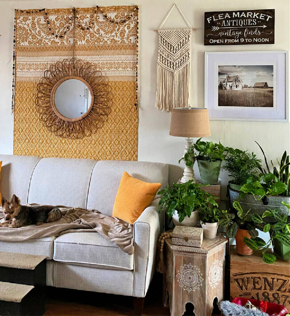
As you see I’m just sprinkling the yellow-gold color here and there. With all the green plants, they kind of tone down the bright colors I think. Well, maybe.
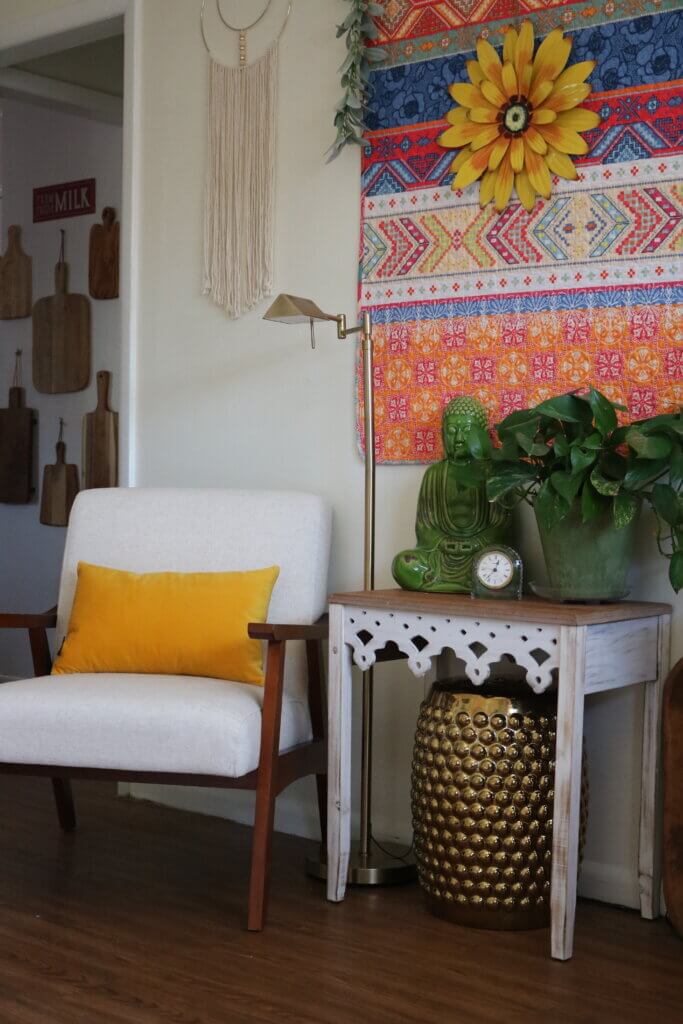
Look opposite and you see another yellow-gold pillow on the chair. I like to use neutral furniture and then spread color on top of and around them.
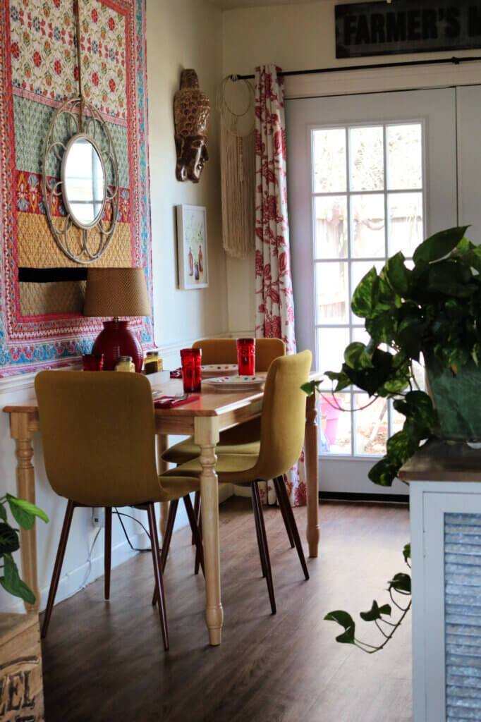
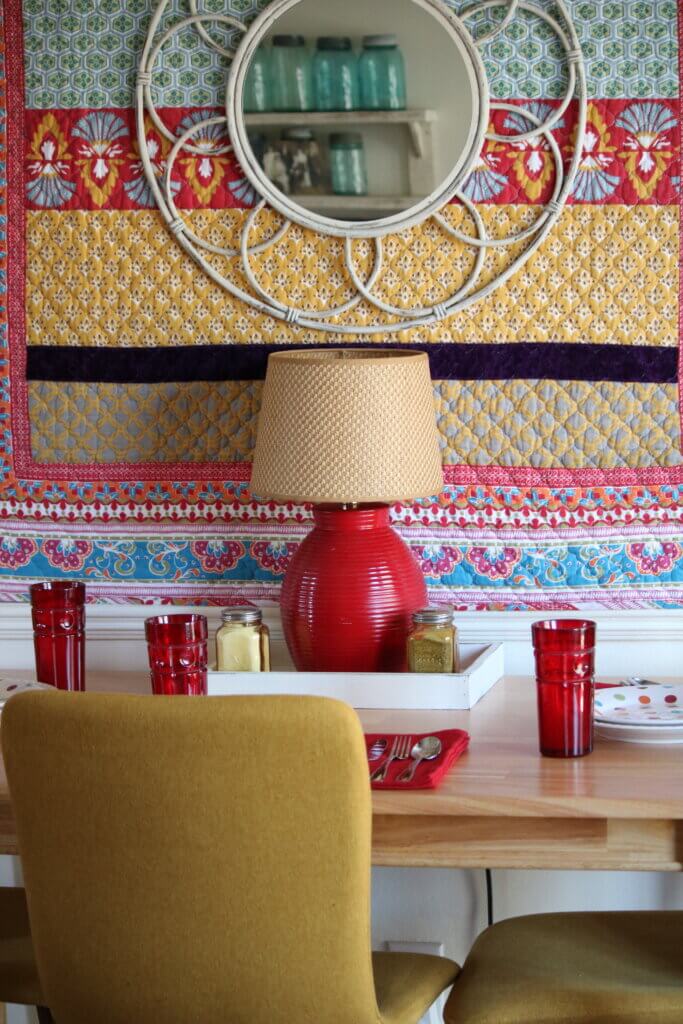
The dining space:
Now in this big open area is my dining space.
The chairs are the choice of yellow-gold color in here. They aren’t the bright yellow-gold shade as the couch pillows, but a more muted gold.
Muted is fine. You don’t want people’s eyes to pop out.
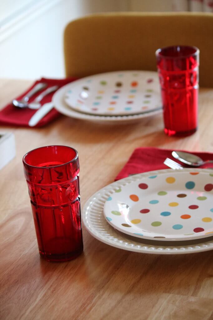
A tablescape to show my chosen colors:
We’re going to pretend Kasi and Kendra are coming for lunch and I’ve set the table (which will happen after the second vaccine).
I wanted to set the table to bring in the colors I use through the salad plates. I’ve given away most of my dishes because of lack of storage. But I did keep a few extras like these because they are the primary colors I decorate with in my home.
And I believe I have four plates of the same polka-dotted pattern somewhere. Probably in a box under the bed.
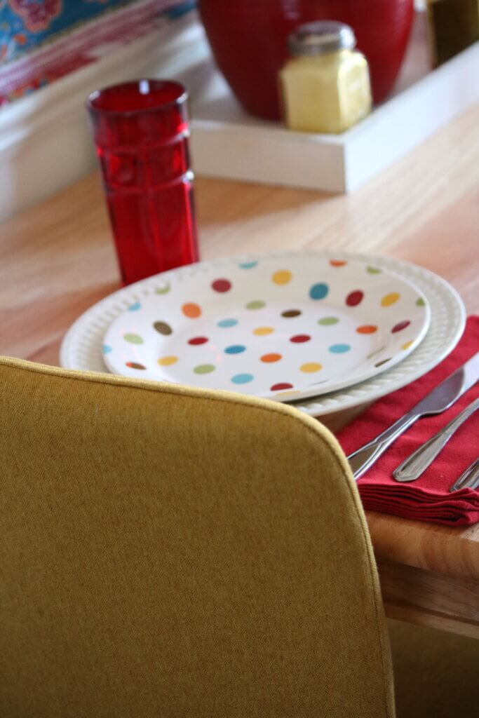
Those are my colors: yellow-gold, green, red and turquoise. Chosen right there from a salad plate!
Driving color choices:
Now you see how one thing can drive your color choices. The various colored polka-dots of the salad plates basically drove the color decisions for my entire apartment.
I’d like to add a bit more turquoise to my home, but in small amounts. I’ll get around to it eventually. I do have two couch pillows of that color in the closet now that I think about it. Maybe I’ll get them out.
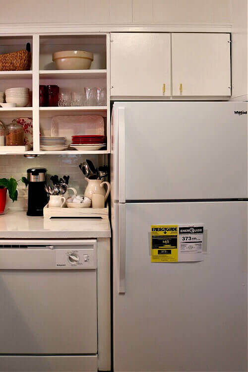
The kitchen:
Now we’re in the kitchen. Just a small pop of yellow-gold in here. But lots of red and white of course.
At some point I’d like to bring the yellow-gold color in here a bit more.
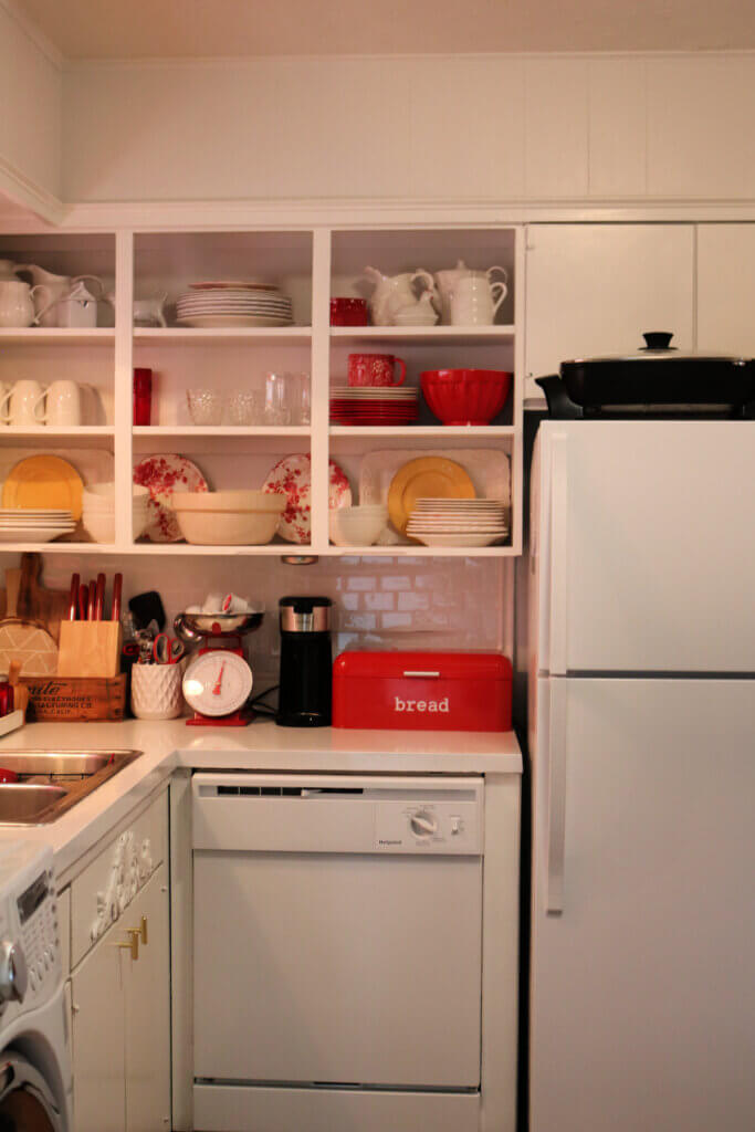
Just a small bit of the yellow-gold color:
I added two yellow-gold salad plates I got at Pier 1 long ago on the shelves with the dishes.
I wanted you to see how two salad plates bring your eye straight to them when you look at the photo. If you didn’t notice, blink and look again.
For some reason I think that bright cheerful color is just a beacon for the eye.
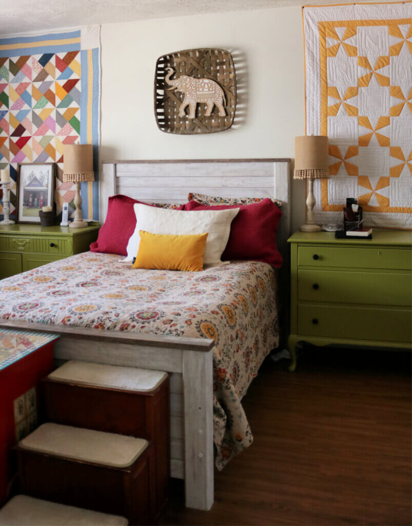
The bedroom:
Now we go into the bedroom.
The yellow-gold and white quilt on the wall is what got me started on this color in the first place.
I found that quilt online in a clearance sale somewhere quite some time ago.
I don’t have any of this yellow-gold color in my bathroom yet, so I skipped that room.
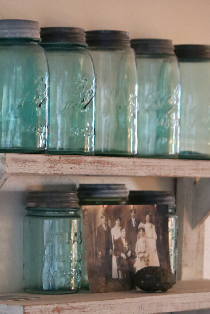
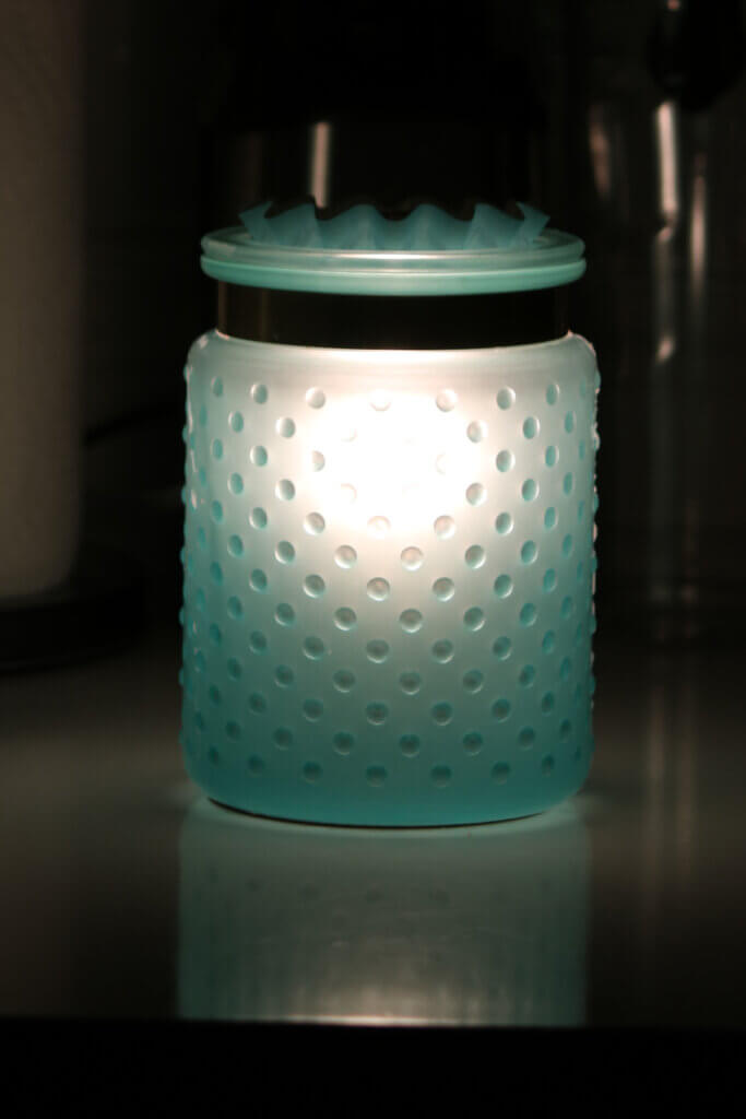
After I thought about it a minute, I realized that my vintage Mason jars bring in a touch of turquoise. As well as the wax warmer in the kitchen. So there you go.
Still, I want to add a little bit more of this color.
Using color judiciously:
Now you see how I have used a bright color (the yellow-gold) judiciously. I didn’t paint the rooms with it. Just layered it here and there for emphasis.
You want to draw the eye from room to room in a small space. That’s easy to do with color.
Drawing the eye seems to make a space appear larger than it actually is.


You are quite an interior decorator. Thanks for sharing your cozy little house.
I just saw an episode of “Unsellable Houses” yesterday on HGTV and one of the things they said stood out to me. Their recommendation for decorating a smaller home is to have one color that you use a bit of in each room to creative cohesiveness. I think that’s exactly what you’re talking about here and it makes sense to me. Thank you.
I’ve enjoyed your sense of color and decorating style for years. Your home is beautiful, warm and cozy. Thank you for sharing!
Love all of the color. What I really want to see is your closet! Tee, hee.
I love your kitchen. I wouldn’t change a thing in there. Just the pop of the yellow plates is perfect!
You are just so talented. I never tire of seeing your pictures.
Lovely home from your choices. The polka dot plates are fun so that adds to the happy feeling in your home. Your home decorating is some the best I see.
I surely agree with that.
Your apartment is lovely. I use more muted colors, but the way you use bright colors is amazing. Well done!
Brenda, thanks for the decorating post. Those are my favorite! Do you remember the Layla curtains I asked you to look at? They arrived and I’m so pleased. I was expecting really sheer curtains but they aren’t. They are just heavy enough to hang beautifully. And, with the colors of orange, turquoise, green, red and touches of yellow, they are a feast for the eyes. It will be easy to select an accent color. What a happy dining area I have! These are hung on the patio doors which is to the right of my round table. Could you suggest an appropriate centerpiece? Thanks.
Well, since it’s spring, how about a plant? Or a spring vignette?
I will do just that…thank you, Brenda.
Good Morning Brenda!
What good informative information. I feel like I just had a personal tutorial from a friend on how to apply color evenly throughout the house! I personally love that yellow-gold color; it feels happy and sunny year ’round. And, your charming red bistro style kitchen is always a treat to view! Thank you for this post, very helpful…
Today feels good, sun is shining for now…. Hope you and your fur-babies have a wonderful week!
You have a wonderful sense of style. I am learning a lot about decorating from your posts. I downsized into a small cottage and am just now starting to put some color on the walls. Now I’m afraid I may be overdoing it…turquois on the kitchen walls with a medium shade of yellow into the adjacent living room. I thought I liked it until I saw your French county cottage. That always happens to me: I like something, get started and then see something I think I like better. I suppose it will all be fine and I can always redo yet again.
Try removing the decor one thing at a time. Then putting things back one at a time. Step back and look before adding another item.
Tasteful, cheerful, colorful, peaceful, beautiful, cohesive, interesting and comfortable are the adjectives I use in describing your home. I think you have hit every nail directly on the head! I actually have plates
with the colors I am trying to incorporate in my home. I can see pictures of things that I love and how you have decorated your home, but have trouble envisioning a project at the beginning. I love watching renovating shows on TV where they take a rundown home, change walls, floors, fixtures etc., and make it totally different. It is starting at the beginning that is where I get stuck! Thank you for this post!
Every room is just beautiful! I have learned so much about decorating from you! I love the mason jars with the photos !
Brenda, I love what you have done with your space. Your colors are my colors.
I am so sick of seeing the depressing greys the sheep are using. Keep up the good work.
Mary Jones.