Decorating Tip: Drawing The Eye With Color
I often mention “drawing the eye with color” when I’m referring to decorating. In years past I’ve just put a jumble of colors out there and thought it looked fine. I’ve mixed every color of the rainbow into my quilts, and I love every one of them.
As I’ve gotten older and actually tried to make sense of my decorating style, I realized that I needed less color instead of more. If you have too much color, it tends to look cluttered and the eye has nowhere to land in order to rest.
Live & Learn:
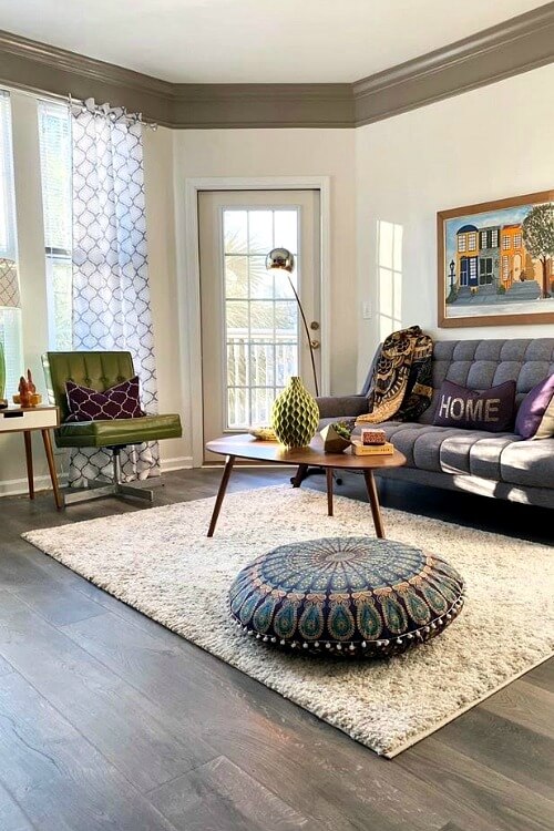
If you have more neutral pieces of furniture in your home and just scatter your chosen color palette, it is far more pleasing I think. Which is why I chose an oatmeal colored couch. I think the color is actually called Sugar Shack on the upholstery I picked.
But it looks good with everything because it is like an empty canvas just waiting for color to be added. And because of the light color, the room doesn’t seem saturated with darkness like it was before.
When I chose the brown furniture, I did not realize that it would somehow make the room feel smaller and darker when in that space.
Lesson learned.
Neutrals are good bases:
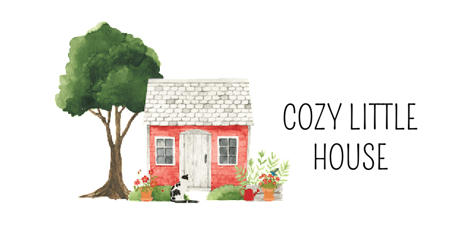
The Hobby Lobby pieces of furniture I chose are wood and galvanized steel. They are good bases upon which to add your chosen colors more deliberately rather than randomly.
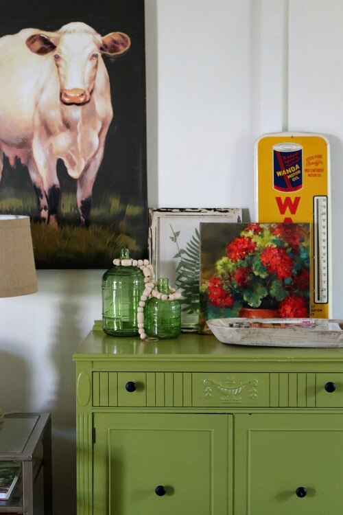
Let’s start with when you walk into my apartment. If you look behind the recliner, you will see my green vintage cart loaded with quilts I’ve made. I painted the cart a few years ago in my chosen green shade that I so love.
The window has the cream and green curtains. The photos I’ve taken and framed above the vintage cart are of the countryside, and add more dabs of green into my decor.
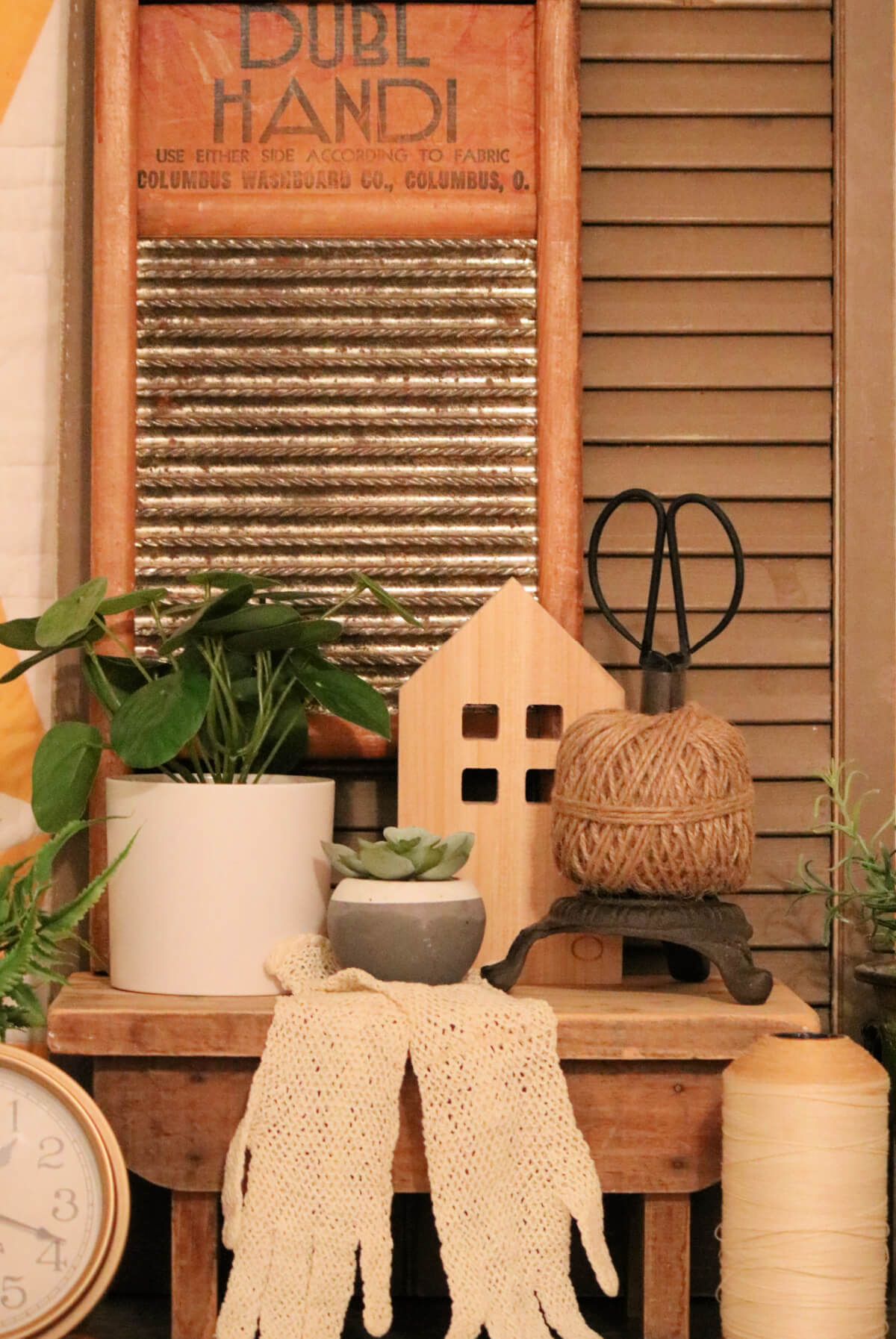
Then there are neutrals signs on the wall and my old washboards that I’ve carted around for many years.
Throw Pillows:
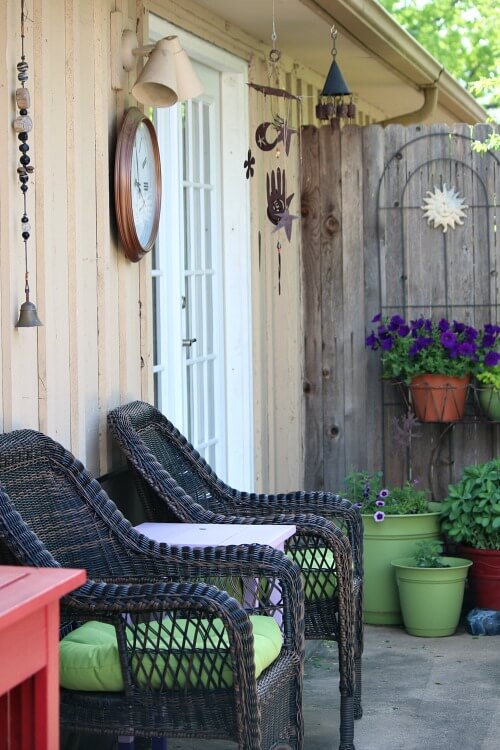
I brought the green and white pillow out of my closet and put it behind the burlap pillow on my couch. You see I am drawing the eye inward ultimately toward my outdoor room (patio). The other pillows are neutrals and a red and white one to spice things up and bring a bit of red into the landscape.
Then you see the green sideboard. And the two paintings leaning against the wall, one botanical and one of the red geraniums. With more green sprinkled in.
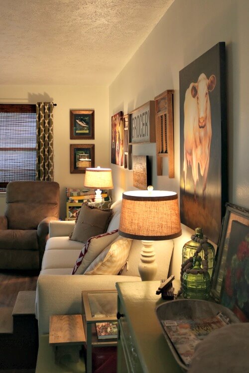
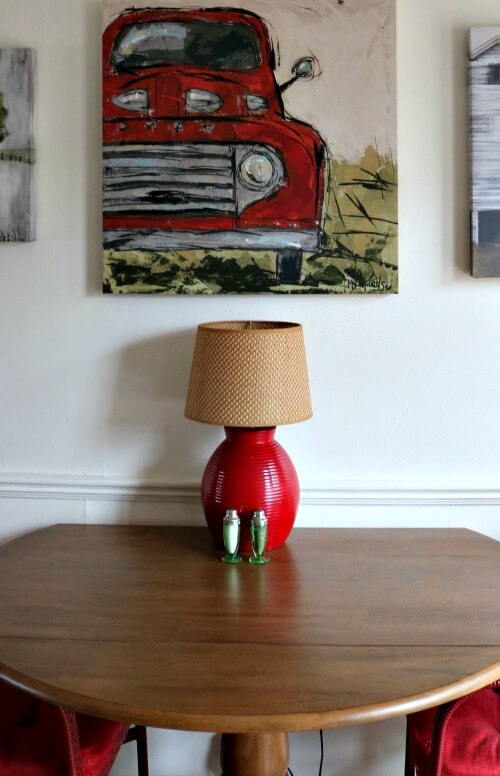
Along the same wall is my wood dining table and red chairs. Oh, and Ivy underneath. I just noticed that!
Red is my secondary color. But it is such a bold color I don’t want too much of it.
Through the French doors:
Before we head along the opposite wall, let your eye draw you outside to the patio. Here is the view through my French doors.
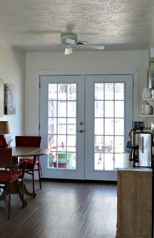
Once we open the French doors and walk outside, we are met with more green and spots of my secondary red. Along with the added purples I’ve added to bring a feeling of serenity to the space.
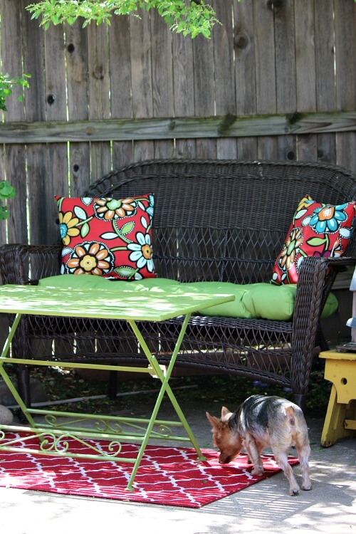
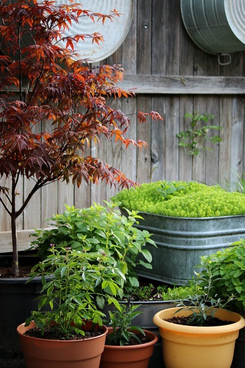
The colors of nature:
Nature brings us lots of beautiful shades of green. I’ve added a bit of red here and there to liven things up, but hopefully not detract from the nature outside my door.
These various shades of green draw the eye down the fence, where plants are growing bigger by the day.
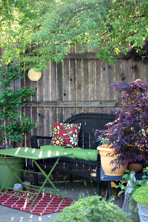
And so it goes throughout my patio.
On the opposite side of the fence is my red potting bench that I brought with me from Texas nearly 8 years ago.
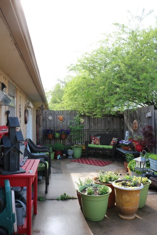
The way I decorated my indoor rooms and the outdoor space were to focus on my chosen color of green. Because it is the color that makes me happiest while also bringing me the greatest sense of tranquility.
Everyone needs a tranquil space in their life!
Choose a palette with limited colors:
My chosen color palette outside are green, purple, and a bit of yellow and white. Several of my pots are red, as well as the potting bench. And then there is the small red and white rug.
Sprinkle your secondary color in here and there. Along with any other colors in your chosen color palette.
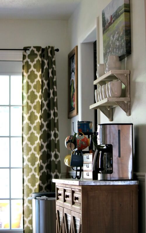
Once you come back indoors, green is used more sparingly. I’ve already drawn your eye outdoors, which is where I wanted it to go to see my beloved patio space.
Outdoor rooms are an extension of your indoor living space. You gain so much square footage by using the space that is right outside your door.
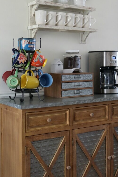
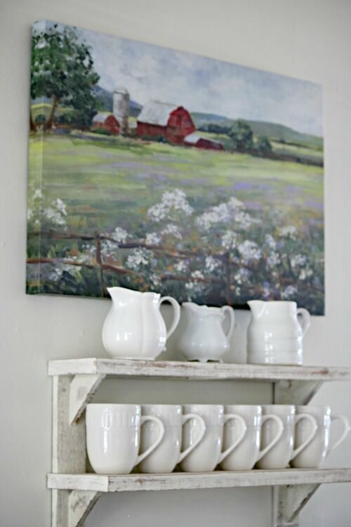
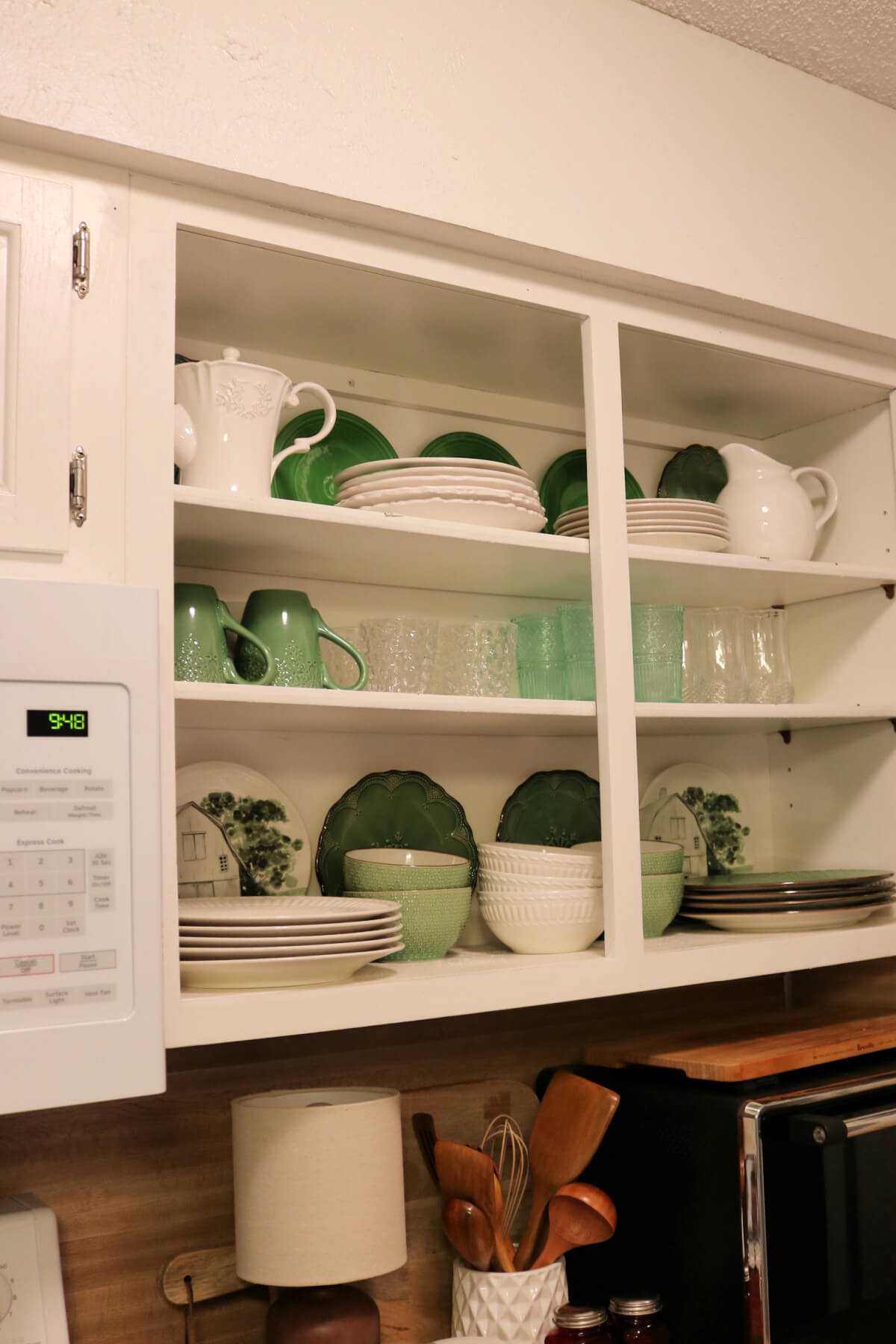
Green is picked up again in my coffee mugs and in the painting above of a barn in the countryside situated among a field of wildflowers.
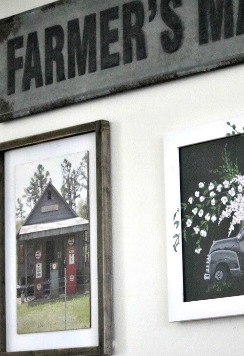
New piece of wall decor:
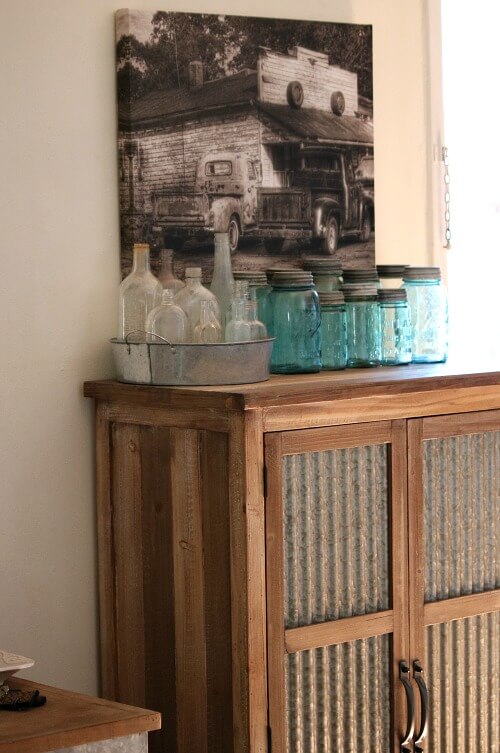
Then back to the living room space, where I have added a new piece of wall decor. The other day at Hobby Lobby I picked up the painting of the old filling station.
They gave it to me half price because someone forgot to take last week’s sale price tag down. It was all I bought and I got it for around $10.
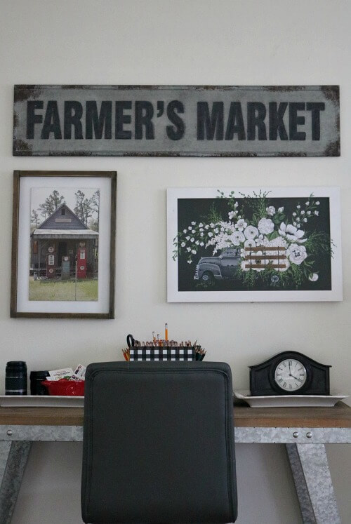
I think it fits perfectly with this wall theme that is more rustic in nature along with the painting above my craft cupboard.
No right or wrong way to decorate:
I’ve probably worn your eyes out with photos by now!
There is no right or wrong way to decorate. As I’ve lived through the years, I’ve filtered through many styles. But I always come back to an element of country, my walls filled with tales from another time when life was so much simpler.
The old signs and photographs I’ve taken and enlarged and framed are precious to me. As are the trinkets of old door knobs and bottles and jars.
For me this look will never go out of style. It is a reminder of my youth and what I saw through a child’s eyes.
It is I suppose much like going home.

Brenda, I love your style. You have a great eye for decorating. Thanks for sharing it with us.
Julie
The small touches of red are just perfect. When we ever get a new sofa, I want to either go with an off-white or cream or maybe even a light gray. Right now we have a tan/oatmeal sofa and which we’ve had for 13 years and I’m tired of the color.
Brenda,. I love what you have done. I look forward to seeing you posts.
All of your pieces work so well together Brenda! I tend to stay with a neutral palette as a base and then use color in my accessories. It’s easier for me to visualize things that way and cheaper for me when I get tired of a color. Love and hugs!
I love it all!
Everything looks so pretty and well-organized, Brenda. I like the lighter look of your new couch and recliner. And I love your rustic touches–right up my alley! It’s always fun to see what you’ve been doing decor-wise. Thanks for the “show and tell”.
Love how you’ve decorated, and I really love your new picture. I appreciate your sharing your thinking process as to how you put it all together. I too love green. I mean I REALLY LOVE green! So, here’s my question: what paint did you use on the piece of furniture in the first picture – brand and paint name? I need to paint some furniture around here (from another shade of green, no less), but I don’t want to strip the old stuff off. I’ve used chalk paint a lot in the past but the colors aren’t as vibrant as what your piece of furniture has. Did you have to strip the old paint off before you painted that piece? Any info would be appreciated!
Your home is lovely and your patio with all the flowers is beautiful. Another way to lighten up your room would be to use curtains the color of your living room wall and add a trim to the edge with the stitch witchery…iron on product. My dil did this and it looks great. Just a thought.
You make a beautiful home with your artistic eye. You bring nesting to new heights of peace and serenity.
It all works perfectly together . I love everything from the quilts to your sweet pets. What a restful place to call home full of pretty spots and cozy warmth, plus an outdoor space that is beautiful.
Brenda, it is lovely and to gaze through those French doors to that adorable, peaceful patio, WOW! You definitely have an eye for color and the placement of color throughout your home is very homey feeling. Bravo!
Carol and Molly
xoxoxo
Brenda, your house is so collected and cosy! I love seeing all of your treasures. The patio is already looking so bright and green. I hope y0u get to sit out there before it is too hot.
I found myself smiling as I read your post and viewed the photos. Such a nice space — inside and outside. What a wonderful time of year for those of us who love to spend our days getting “dirty.” And how nice to come inside into a home so inviting. Take care and have a wonderful Wednesday.
Where did you get the geranium art work?
Nancy Medina, an artist in Texas, painted it for me because of my love of red. She paints gorgeous flowers. She has a website. Just Google her.
Thank you for the tour…all just lovely and inviting!! I really enjoy the old time photos of old trucks, etc…the reminder of a gentler, kinder time is so welcome in this crazy world!!
Your home is charming and beautifully decorated both inside and out, my friend. You have a true eye for decorating and it shows in every well placed detail. It truly is spring in your neck of the woods, while here in the mountains we are looking at cold temps for the next week or so!
I love your apartment and garden, they are beautifully decorated and well-arranged. We all need a sense of serenity and peace from our shelters. They are our havens from the often crazy world, a place where we recoup and rejuvenate. It should reflect what most brings us feelings of peace, calmness, serenity and satisfaction. Just wanted to note that Charlie and Ivy are neutral colors and they go with everything 🙂 There’s a reason that some basic classic rules of decorating have been around since mankind first started making hand prints in outline, black and umber colors on the walls of caves. The tried and true of 60% main color, 30% second color and 10% another color or colors for a bit of pop, along with wood, metallics, green house plants (which count as neutral if they don’t have flowers) against backgrounds and furnitures in various shades and tones of white, black, grey, and beige/taupe let the colors in the accessories sing. After years of reading the same rules over and over again, it finally sunk in. Now when I want to change my decor I can do so by buying some throw pillow covers from H&M, Ikea, and Bed Bath & Beyond, putting up new “art” I print for free from the internet and stick into my tried and true frames in black, dark wood tones or gold, and sometimes buying a new area rug;. Saves a lot of money over having to buy new furniture or pay for reupholstering (expensive). I don’t feel guilty about “wasting money” any longer when I want to change things up a bit.
I love when you share pictures of your home. You have a wonderful sense of decorating. So comfortable and inviting.
Brenda, love your decorating style! All the things you love, I love also. Love the mason jars, quilts, glass door knobs (I have a collection). Love the old filling station pictures, especially the black and white one above your blue mason jars. Is it a new picture? I lack your talent of pulling it all together. Try for weeks to get my mantle to look like I want it, just don’t have a vision yet of what I want except for the big clock I recently purchased.
thanks so much for sharing so many pictures of your home. Im sure I could come to visit and feel very comfortable. Have a blessed day.
Mary
I just wanted to say I love your home. It is like a beautiful cozy cottage. I feel like a want to grab a blanket and curl up on the couch and talk. Take care and thank you for sharing.
Your home is beautiful, inside and outside!
I just love your home. Its absolutely gorgeous. Everything is perfect and the flow is fantastic. So peaceful.