Balancing Color & Decor in Your Home
This post may contain affiliate links. If you purchase through links on my site, I may earn a commission at no cost to you. For more information, please see my disclosure policy.
Everyone always asks me how to balance color and decor in a home. Without there being too much of a good thing, of course. Today, we’ll look at how I decorated my living room.
Learn to balance different hues against a more neutral color palette, such as shades of brown and green.
I’d say my main core colors are browns and greens. These are more subtle colors, and it’s easier to balance brighter colors when this is your core or base palette.
These are basically the colors of nature, and we all know that in the springtime, colors burst forth against that same palette. And it’s a beautiful sight, those colorful flowers!
How to Make a Room Feel Cozy with Fewer Colors:
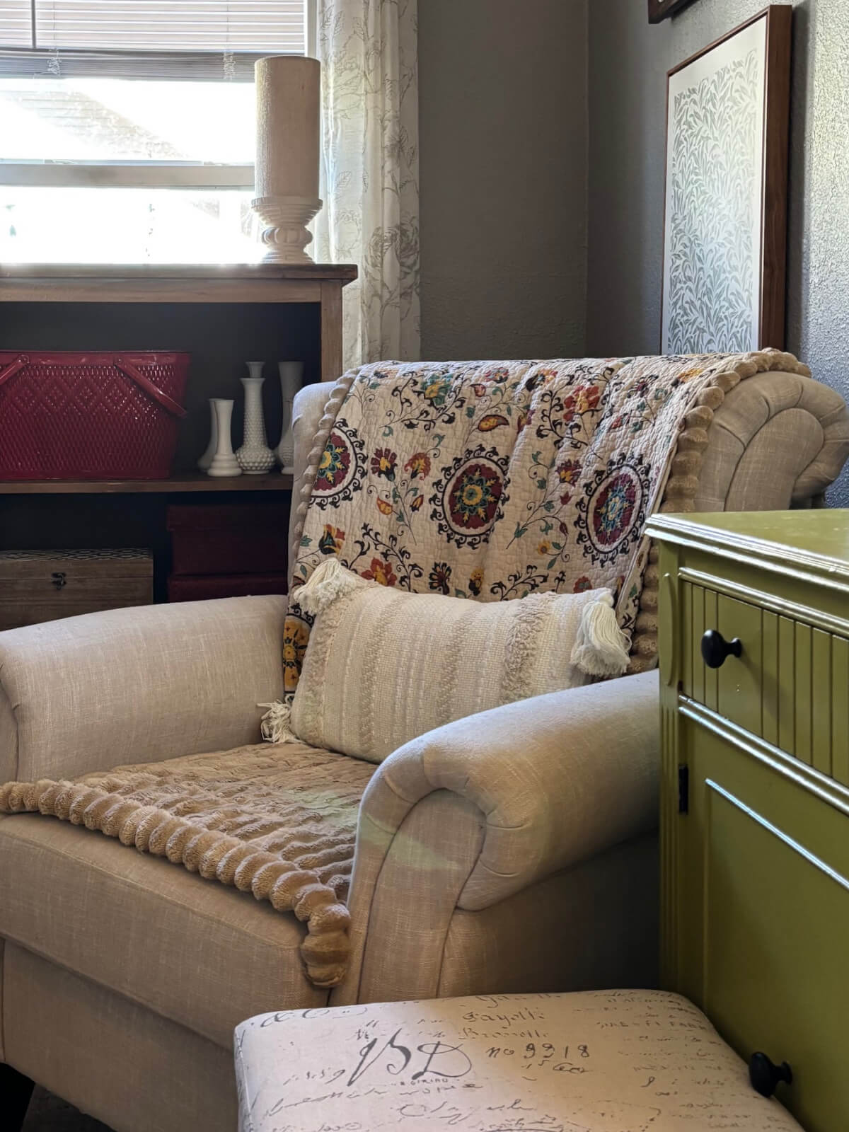
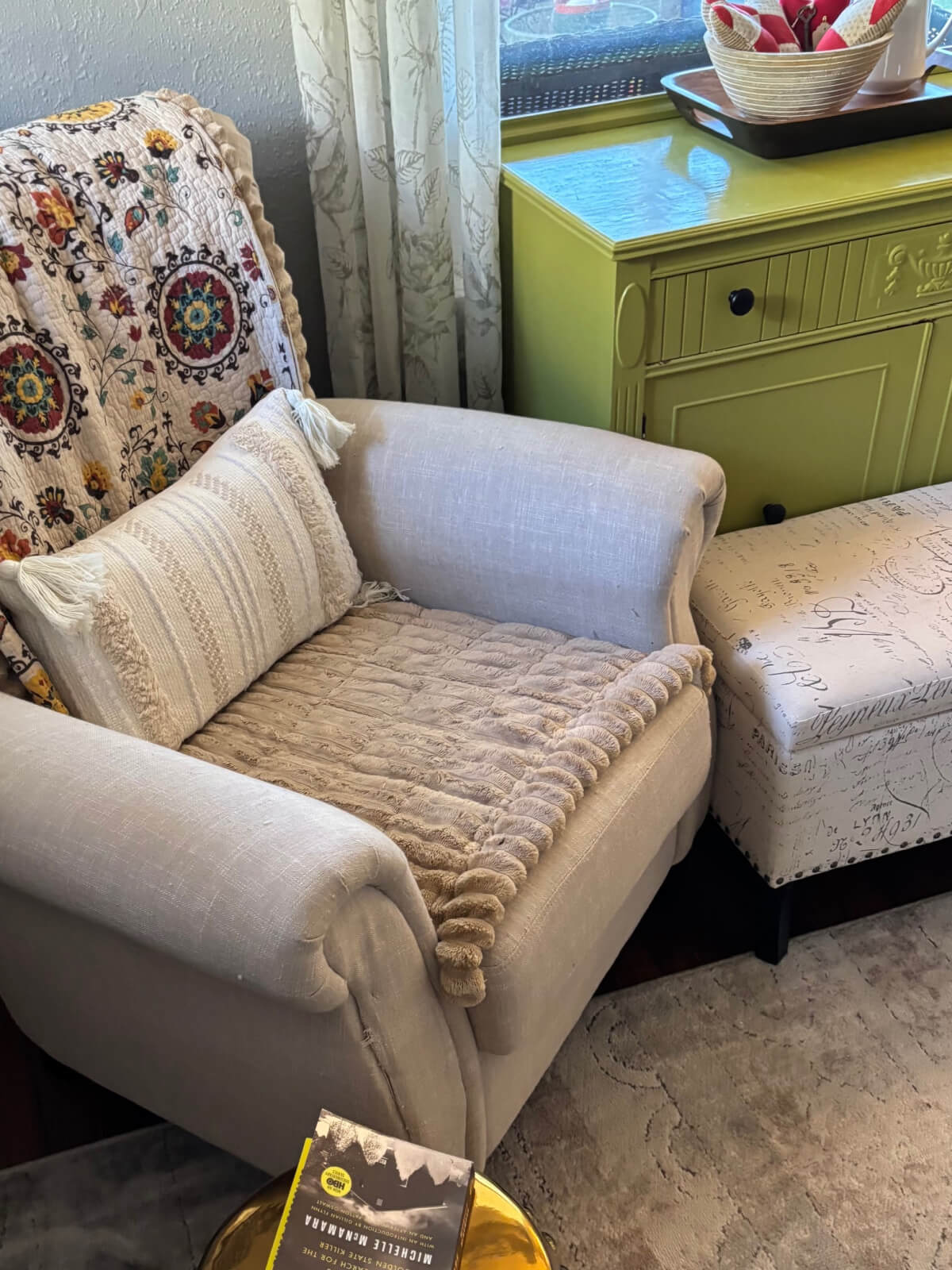
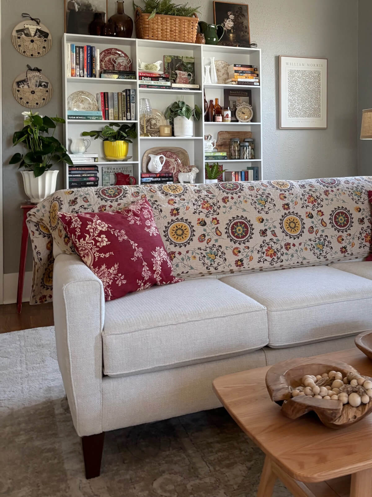
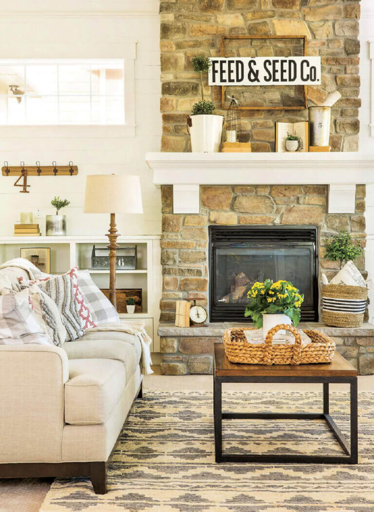
My standard way of balancing color and decor is to use neutral furniture and build on those basics. My couch: beige, the two chairs in my living room: beige. The other furniture in the living room: whites and wood.
Things made of wood bring warmth to a room. There was a time when everyone painted every stick of furniture they had white. Chippy white, to be more accurate. Some still do. It was a shabby chic phase.
But whites can look too stark if there’s too much of it. Bringing natural woods in raises the temperature up a little instead of cooling it off. The walls were already gray when I moved here. My preference is a khaki color for the walls, but I made the gray work well enough.
I favor light and medium woods, as I don’t like to go too dark. Dark woods like maple aren’t my preference. My woodwork and the fireplace are both white. This house is over 100 years old and was built in the Craftsman style popular at the time.

Know When to Edit Color:
This is more of a personal preference. No two people will likely have the same experience when choosing colors. My way to judge colors is just to live with them for a day or so. If it still feels busy after that length of time, I know it’s time to edit or tone it down.
It’s easier to take one decor piece away at a time. Let yourself breathe around the slightly different setup and see how you feel. If it still makes your heart race a little faster, it’s time to take a few more colorful pieces away.
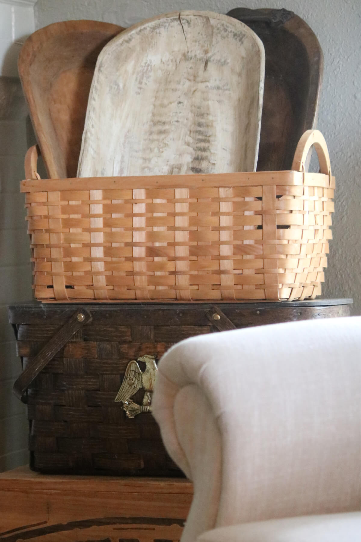
And you can also add decor that is warm but toned down, like these dough boards in a basket. That dilutes your enthusiastic color additions!
To edit judiciously, you edit slowly, a bit at a time. But if the whole scenario bothers you, then take everything colorful away and add one thing back at a time. That may be easier for some.
Choosing an Area Rug:
To choose an area rug, prioritize texture (like chunky wool or jute) over bold patterns to add depth without overwhelming the room.
Select tones—such as cream, beige, grey, or taupe—that complement, rather than match, your furniture. Choose a low-pile rug for high-traffic areas and ensure it extends slightly beyond the furniture.
What’s pleasing about a neutral area rug is its subtle sophistication. It gives you a canvas to build upon. This foundation complements all decorating styles. Think soft beiges to muted taupe. I don’t think white has much place in a highly trafficked room such as a living room.
With an area rug in these colors and neutral furniture, you can bring in any other colors you like. It’s easier to change and switch colors out when you have this as a foundation.
In other rooms, I have more colorful area rugs. But for the living room, I wanted a relaxing space, because it’s where I spend a lot of time, so I chose a lighter shade.
Where to Bring Colors In:
You’re not going to have to worry about too many neutrals, because, ta-da! Add a wall of bookshelves, and you can sprinkle plenty of color there.
Unless you take all the book covers off or decide to make new dust covers for the books, you’ll see lots of colors now begin to enter the room. But you don’t want to go too wild, or you’ll defeat the purpose of decorating a relaxing room.
Try styling each shelf like it’s a separate vignette. You might add more greens on the shelf, or more yellow/gold shades. Sprinkle in a few bright colors. I usually favor red, just to liven things up a little. You don’t need to shy away from spirited colors altogether.
But I’ve learned the hard way that you can have way too much of a good thing. If it starts to look chaotic, you’ve gone too far and should scale back.
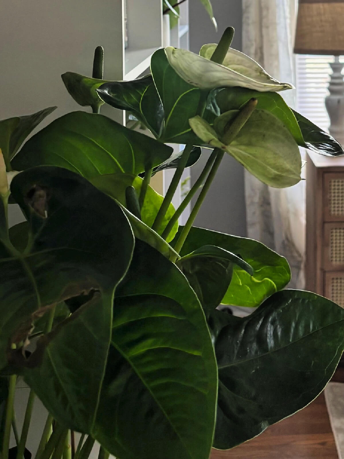
Bring color in with house plants. This has an entirely different aesthetic than a flat piece of decor. This greenery will add layers of texture.
I’d have more plants, but I have to consider the kittens. They’re still in that wild phase where they tackle anything that moves, even a slight amount. And then they’re off to the races!
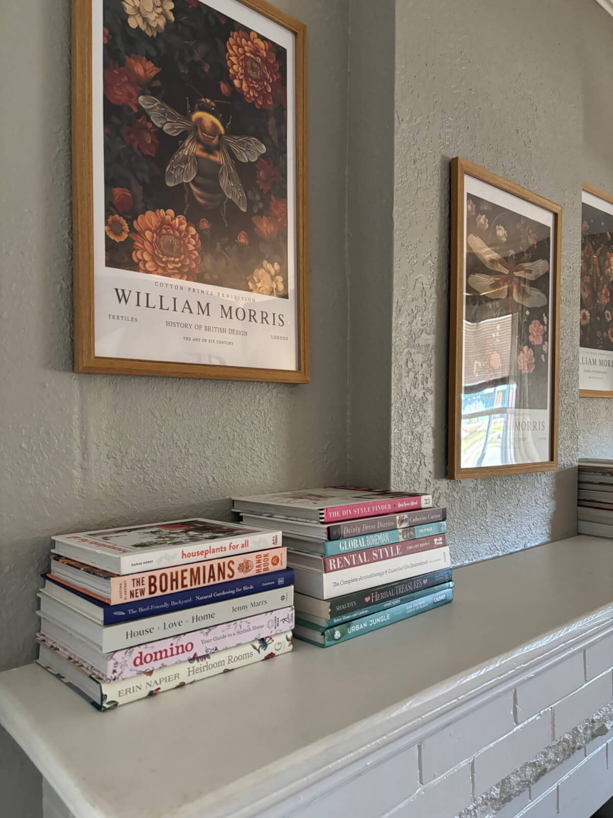
Adding Botanical Decor:
There’s also something a bit neutral about adding botanical decor. It is both nature and color, and they seem to balance each other quite well.
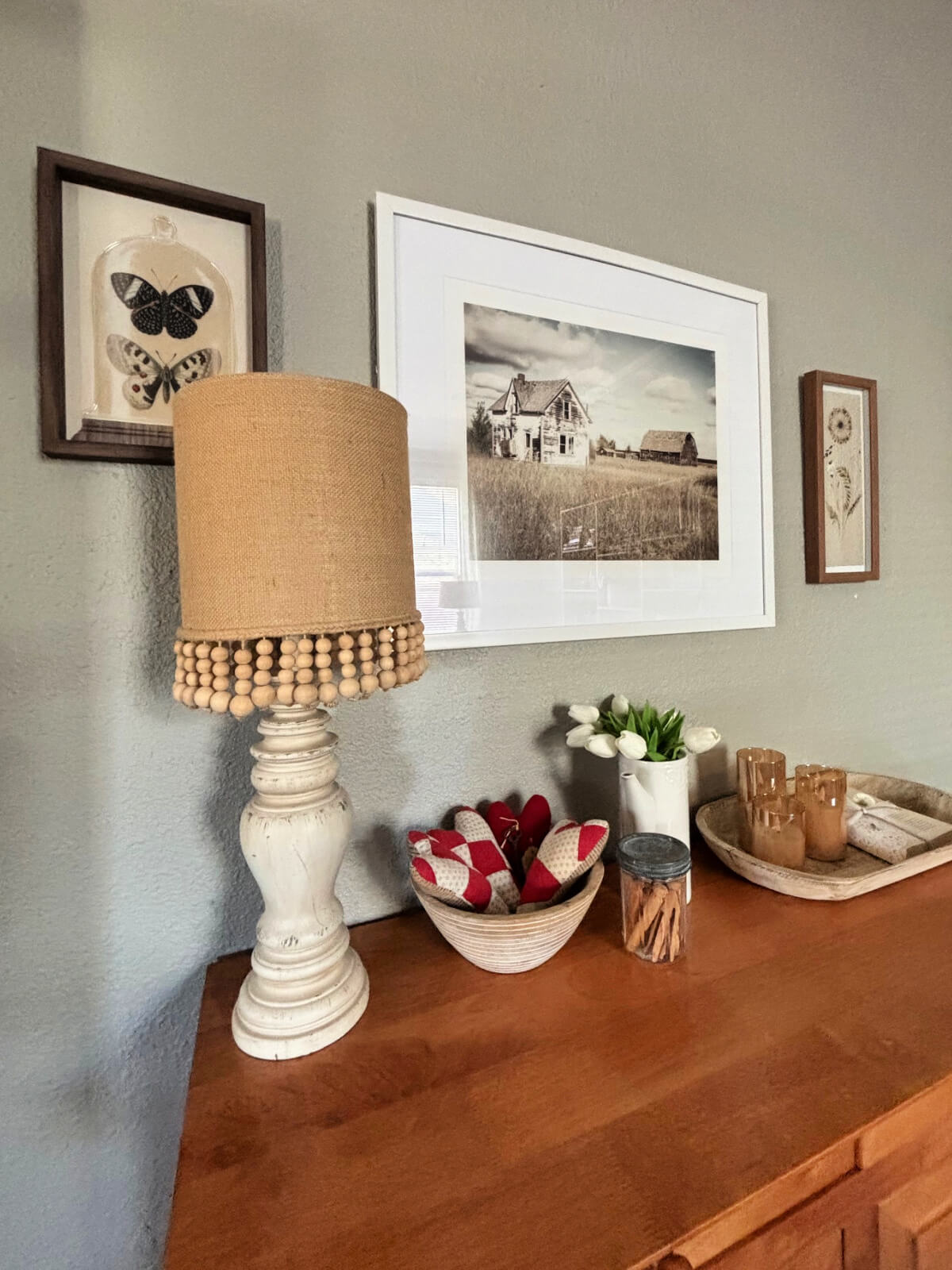
I added William Morris prints of butterflies, moths, and bees. Along with prints of just a few colors on adjacent walls. It’s all about balance.
When you’re choosing wall decor, keep that thought in mind. Below, on a separate wall, I have more sedate style framed prints that elicit a calmer feeling. Landscapes are a good way to do this, as they’re typically more serene.
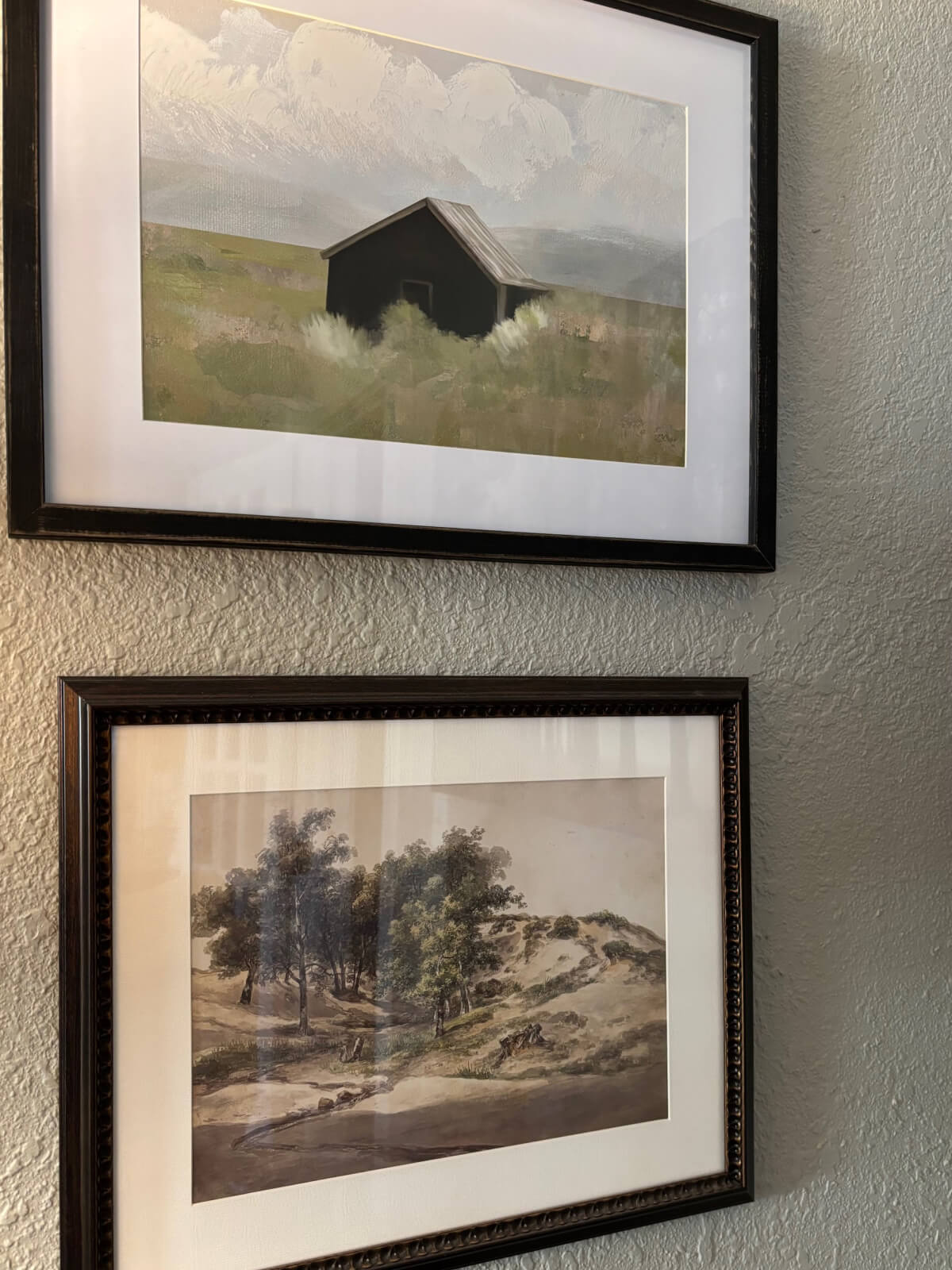
Take the frames into consideration, too. Don’t go too colorful on the frames. It’s best to use shades of brown and black for your frames. They will complement the print and allow the wall space to breathe, so to speak.
Walls:
Also, don’t think you have to hang every piece of wall decor right on the wall.
Lean some of your paintings against a surface. This gives you a lot more leeway when you want to switch it out, and leaning adds a softness. I don’t know how else to describe it.
Layer them. This is also an appealing look in my book. Set some books or plates against the back of your shelves to suggest a vertical layer of decor.
I think it’s kind of boring when every piece of wall decor is nailed up on the wall.
Choosing Window Treatments:
In every room, I’ve gone with lighter-colored and subtly patterned curtains. I tend to go more neutral with vertical areas, such as windows. Because those windows are kind of right there in your face. Too much color there would defeat the purpose if you want a relaxing space.
The ones in the living room are semi-sheer light-filtering curtains with florals in a soft cream and green. There are three windows in the living room, so I wanted to choose something soft in texture and tone.
In my bedroom, I went with room-darkening curtains because I thought it was more important to sleep.
In the laundry room, I chose gray and white cabbage rose-patterned curtains that let light through. For the south room in the back, I went with room-darkening curtains because there are so many windows that it heats up in there quickly during summer.
For the kitchen, I went with black-and-cream toile. And for the guest room and my small office space, I have buffalo plaids in black, gray, or white.
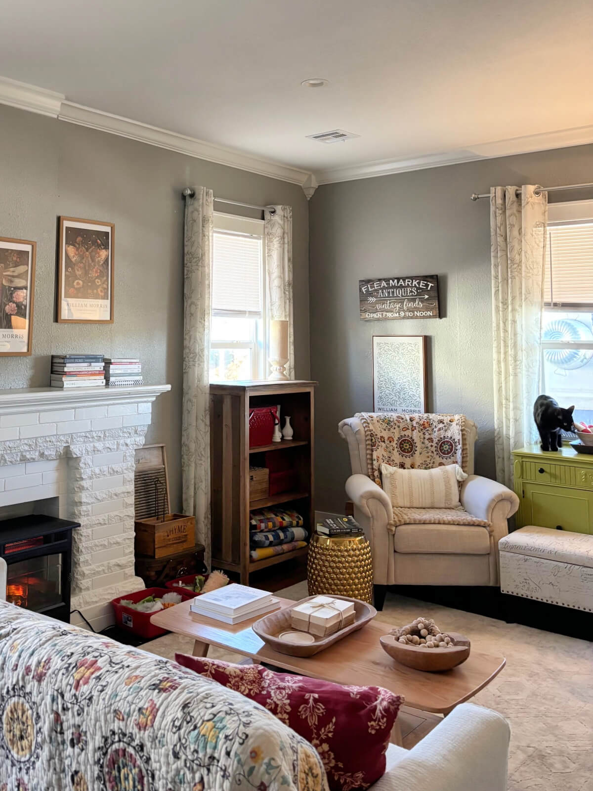
I still feel that the above image has a bit too much color. But it’s a space where the cats play a lot, so there’s always going to be things scattered about.
There are colorful quilts in the bookcase at the window. That sprinkles in more color that goes into the mix. Which I might decide to edit.
Mix it Up:
You need to have one area that isn’t so strategic. In other words, a space that is more fanciful.
This small wall space you see below has one of my favorite second-hand furniture buys. I love it because it’s taller than a normal table/buffet. It has storage, and there’s plenty of surface to decorate on top.
It ticked off every box for me when I purchased it.
On the walls, I mixed botanicals with a landscape-style print to avoid making one small space feel too busy.
I love using table lamps, and I tend to dot them around a room. The lamp is neutral, but the beads at the bottom lend a bohemian vibe. The tulips suggest springtime, which is almost here.
There’s a bit more color in the patchwork hearts in the wooden bowl. This particular wooden bowl was something I found at Tuesday Morning before it went out of business. I loved that store!
So dot your colors about instead of pouring them all into one area.
What We’ve Come up With:
- Choose a more neutral color palette for wall paint and furniture.
- Don’t go with too many different colors for everything else.
- How to choose an area rug for hard surface floors.
- Dilute colorful decor by sprinkling in natural, neutral, and wood colors.
- How to choose window treatments.
- Mix it up. But when you do this, remember to edit.
I’d say that lays out all the tips I have for decorating a living room with a bit of color, without going overboard.


Do you think technology can actually help platforms handle regulatory pressure in countries like the United States?
I think technology plays a huge role in this. You can read more about how systems are built to adapt to legal frameworks. With the right architecture, platforms can remain compliant while still offering a smooth experience for users in regulated markets like the US.
I came across this article discussing tadalafil and workouts, and it gave a useful perspective. It explains that better blood flow may help with endurance and recovery. At the same time, it reminds readers that it’s not originally designed for this purpose. I like that balanced approach. Worth reading if you’re curious.
https://atlasmenshealth.com/blog/should-you-take-tadalafil-for-working-out-dosage-and-benefits-explained
Do you ever find completely unrelated topics while reading blogs?
Sometimes I start reading recipes and end up somewhere totally different. That’s how I found https://lossless.cash/, which is about protecting crypto transactions. It’s funny how browsing casually can lead to learning about something technical and useful.
How can automated data collection help track trends in music, movies, and lifestyle preferences to better understand audience interests?
If you really want to understand what’s trending in music, movies, or everyday habits, it’s better not to try collecting data manually. Using automated tools is much more efficient, as they can track trends and user behavior in real time. For example, you can check out Floppydata, which offers solutions for flexible and stable data collection using headless browsers. This allows you to get more accurate information and scale your analysis without unnecessary limitations.
Some lovely decorating ideas! I, too, have room darkening shades in the primary bedroom. I’m a light sleeper and need total darkness in order to sleep. I have blinds, then a sheer panel, then the room darkening shades over all that. In the summer when the sun is super strong, I can still see light through everything, so I have to wear an eye mask.
You have a real talent for decorating — especially on a budget. Your rooms always look so calm and inviting. You have made an old house very happy and welcoming.
Well, thank you, Ann! I enjoy decorating a home.
Your home is so comfortable.
I think so. I won’t sacrifice comfort!
Is the quilt on the back of the couch from Amazon? Do you have a link for it? I’ve always thought that was so pretty. I agree with furniture being neutral. Then you can bring in color with wall art and pillows, etc.
Here it is… https://amzn.to/4uqIp6D
I absolutely love that quilt throw on the back of your sofa and chair! I’d love to have one like that. I’d also go for a lighter rug but my cocker spaniel would have muddy puppy paw prints on it faster than you can blink!
I love the way you’ve decorated that marvelous, old house! Wish I lived in an old craftsman!
I have the full size quilt on the back of the couch, then a smaller throw in the same pattern over the back of the chair.
Lovely and great ideas!
I failed to respond to your question regarding chicken. I personally don’t care for chicken breasts so it’s all about the thighs. I use them in a variety of ways.
And I don’t like the thighs!
Where did you get the small painting of the barn. Love it. Also, I have the same exact same pattern throw/blanket you have on the back of your sofa and chair.
Hobby Lobby at the half price sale.
Where did you get the beige/cream area rug?
Rugs.com It’s this one.