Decorating Tip: The 60-30-10 Rule
This post may contain affiliate links. If you purchase through links on my site, I may earn a commission at no cost to you. For more information, please see my disclosure policy.
What is the 60-30-10 Rule? It’s a classic design principle that enables designers to create a color palette for a space.
It states that 60% of the room should be a dominant color. 30% should be the secondary color or texture, and the last 10% should be an accent.

In an article by The Spruce, the author states:
The Elements of the 60-30-10 Rule:
A quick 60-30-10 rule example would be the following: Your room has all white walls and a white sectional sofa (60 percent), neutral flooring, side tables, and upholstered side chairs (30 percent).
And then pops of one color around the room using toss pillows, artwork, and other small items (10 percent).
I don’t ascribe to decorating rules. I go with what feels right.
“Green is the fresh emblem of well founded hopes. In blue the spirit can wander, but in green it can rest.” – Mary Webb.
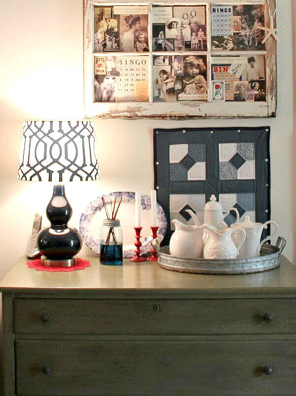
If I had to choose but one color in my home, it would have to be green. With a bit of white for contrast and elements of brown for interest. And I do like to throw in a bit of red here and there.
I now have red predominantly in my kitchen. In my living/dining space, right now I prefer the calmer colors of green, brown, and white. Sometimes blue tossed in as well.
I don’t decorate with as many bright colors as I used to. It isn’t that I don’t like them. It’s that I’ve been indoors so much while healing and I need healing colors to relax me.
To me, those colors represents the earth and the trees; all of nature. And I am a nature girl.

As a person who loves plants both indoors and outdoors, green represents the plant. And brown is the dirt that cups the plant in its hand.
Blue + Yellow = Green:
Green is the mixture of blue and yellow, and it can be seen everywhere and in countless shades.
Did you know that the human eye sees green better than any color in the spectrum?
We see green with ease because of how light reaches our eyes. The human eye translates waves of light into color.
The cones in our eyes are able to process the wavelengths and tell the brain what color is being observed.

Our Perception Of 3 Primary Colors:
Humans are considered trichromats, which means we perceive three primary colors. Those colors are blue, green, and red.
An individual with normal color vision requires that three primary colors be mixed in order to match the perceived spectrum.
Using Shades Of Green In Our Homes:
Using the color green in our home decor adds an earthy and grounded feel to any space. Shades of green can appear both calming and energetic at the same time.
It’s no surprise that many people choose to decorate with green and blue. They are neighbors on the color wheel. Together they form a refreshing combination.

An example is my grouping of bluish-green vintage Mason jars arranged on my fireplace mantel.
When you are looking for color combinations that work, just look to nature and you can’t go wrong.
Questions About How To Read The Emailed Blog Posts:
Some of you have emailed me with questions about the posts that get sent out to you. The question has been how to read the rest of the blog post.
Just click on the blog post title and that will take you to the remainder of the post. The blog post title is actually a link.


I love green…and blue and yellow and red and purple! That’s the problem, I like too many colors. 😉 Right now my living room and kitchen are neutral with pops of blue and a little green. I change things up all the time though.
Great post. My house is green and brown with a small amount of blue. At this point I would like more green.
I always gravitate toward blues and greens and all the variations of them. I am a Pisces, so water colors go with my sign. Not that I pay that much attention to the Zodiac signs. Anyway, I found the information about the human eye responding most to the color green interesting. I like to mix different shades of blues and greens with more neutral colors in my decor, too. I can’t feel comfortable around much red or yellow in the environment. Although, my favorite flower is the the daffodil and I love bringing a bunch inside in Spring for a bouquet. I wonder how the colors in our environment when we are little and growing up influence our color choices when we are adults. When I think back on it my environment as a young person was pretty blah! Don’t know if that means anything or not!
Thanks for the interesting post on color, Brenda. (Keep doing what you’re doing!)
Brenda, could you demonstrate how to propagate certain plants?
Unrelated to today’s post (I have already commented LOL); but someone just told me about a BBC crime drama series Shetland that takes place in Scotland. I looked it up and it started in 2013 and ran for quite a few seasons. Anyway might be worth a peek if you haven’t seen it already:-)
I’m watching it as I write this!
Thank you, Brenda—I had no idea about the 60-30-10 rule!
But I’m like you: I do what feels/looks right and comforting to me. That turns out to be mostly green and blue, interestingly—especially with what you’ve told us today about humans and the color green.
No wonder I keep getting more and more houseplants as the stress in my life increases! I now have a grand total of 18. 😁
Praying hard they’ll fit in new, much smaller home—I have to move and downsize significantly soon, because Wasband (= “Was my Husband”—learned that in DivorceCare group 😄) filed for divorce out of the blue.
But when I look around my living room and adjoining kitchen, my soul says “Ahhhhh…” because almost all of the plants are in here! Added bonus: The air must be *very* clean in here, especially because I have many Pothos, which can withstand a lot of ignoring/forgetting to water. 😋
Kimberly, I’m so sorry about your Wasband! His loss, right?!! And that is the funniest and most clever should-be word I’ve ever heard! You hang in there, and I’ll say a little prayer for you. I’m thre words of Gloria Gaynor, I (you)Will Survive!
“In the”, not I’m thre… typos!! Sorry! 🤦♀️
Thank you sooooooo much, Laura, for your kind words! They mean a lot to me.
And, yes, every person I use (and explain) that word with always likes it and laughs. 😅
Kimberly, you stay strong. I too have had the same urge to buy more plants for stress relief. Take care of yourself. I will be sending you light and love.
Thank you, Cindy, for your kindness. It helps me a lot right now.
And it sounds like I’m in excellent company about buying more plants!
Just ordered a book I heard about tonight: 100 Days to Brave. Ordered the Journal, too! 💪
Hi Brenda,
this article was fascinating. I am a green girl also; my husband and I moved to Washington state from Smyrna Georgia over 20 yrs. ago. We bought a 3 acre horse/farm with the biggest shop/garage I’d ever seen. Up here, houses are smaller and out buildings larger because of the rain. We garden, raise chickens and a few angus cows. This state is one of the greenest; ferns (one of my favorites) and moss grow wild here!
Love your blog, it’s so interesting! So glad you are healing, I pray for your health everyday; so you can get back out there.
Have a wonderful rest of your day!
Thank you for this post. Green is a great color to use anywhere and everywhere. IMHO, It’s the color of life and living things and I love to be surrounded by it.
Fabulous post today, Brenda!
My favorite color is red but can’t use it as a dominant color because it would just too much. LOL I use it as a secondary color in my home and I love the way it looks and works throughout my home.
Yesterday I purchased a new to me cabinet I plan to use as a coffee bar in my kitchen area. I’m really excited about making some decor changes and feel a little more settled in that area.
Thank you for sharing today – enjoy your day, Brenda!
I have come across that 60/30/10 rule from time to time and it makes sense, especially when one may not know where to start like when decorating a first apartment or home. I’m not sure I have followed it. My home is decorated in various shades of black/white/gray in the furniture, on the walls, the carpet and area rugs, curtains throughout, with small splashes of color here and there. I have a lot of wood tones throughout the house. Overall there are primarily neutrals. This season in the living room the little splash of color is magenta in various prints on the walls, and different textures and shades of spring greens in a few accessories from my stash and the throw pillow covers. I like to rotate the art and the throw pillow covers as the seasons change. Although there are lots of gray walls in various shades (and the black accent wall in the living room I painted last November), I get so much natural light in this house it doesn’t seem gloomy or cold. Looking around, I feel calm, serene and cozy in my home, especially at night when I use low lighting (25 watt or less) or no lighting but a few candles.
I am a green girl and love all colors of green. I also love blues and greens mixed together:-)
Love that you said “brown is the dirt that cups the plant in its hand” – what a beautiful visual statement:-)
Colors we see together in nature make beautiful palettes in the home as well. Look outside, be inspired!
Great post Have a great day!
You don’t need any “rules” for that!
I’ve heard that before about green being the easiest eye color for people to see. Interestingly, dogs only have 2 cones in their eyes, and therefore they can only see two colors… blue and yellow. Everything else is shades of gray to them. I love the green and blue Mason jars on your mantle, highlighted with the soft white fairy lights. I find that very relaxing. I think in addition to soothing colors, a clean and uncluttered space helps to add to the zen feeling. I tend to follow my heart when decorating. If it makes me happy and I feel good being in that space, and enjoy spending my time there, then that’s what I go with.
You and me both.
That is interesting about the eye seeing green the best of all colors. Happy New Week.
You too, Kris!